
It is like a book.
‍
The logo is the cover.
The brand is the content.

What is a book with a nice cover and empty pages?
‍
Let's build a brand balanced on

concept, aesthetics, and function.

Branding &
Graphic Design

Every project starts somewhere. Usually, that somewhere is nothing more than a name and a vague idea. No visuals, no direction, no system. Just a concept waiting to become something real.

This is "just a logo"

Turingears logo with split blue gear icon and orange center on black.

This is where most people stop. A logo that works, looks clean, and does the job.
But a logo alone is a static asset, it can't build a presence, communicate authority, or scale across platforms.
It's a cover with no book inside.

This is a "visual brand identity"

From that single mark, a full visual language takes shape. Color system, typography hierarchy, brand guidelines, logo variations, pitch deck... Every asset needed to show up consistently, whether that's on social, in a pitch, or walking into a room.

Turingears visual identity manual cover with network graphic and brand mark.
Turingears brand manual index page listing identity sections in Spanish.
Turingears brand manual introduction page with Spanish identity guidelines text.
Turingears concept page linking Tecnología, Personas, and Datos with gear icons.
Turingears construction page showing gear-logo geometry with red guide lines.
Turingears isotype construction with blue gear segments and an orange center.
Turingears imagotipo layout with gear mark, wordmark, and Gestión de Datos tagline.
Turingears clear-space diagram with gear logo, wordmark, and 1X reserve area.
Turingears typography page showing five Roboto weights with Spanish usage notes.
Turingears primary colors: navy, sky blue, and orange swatches with hex codes.
Turingears secondary palette with tint and shade scales for blue and orange.
Turingears gear mark in black on white and white on black positive-negative versions.
Turingears grayscale page with four gray swatches and matching gear marks.
Turingears black and white logo opacity steps from 100% to 10% on mixed grounds.
Turingears full-color gear logo fading from 100% to 15% opacity on white and black.
Turingears logo scale guide with large, 30×23 mm, and minimum reproduction sizes.
Turingears vertical logo variants with and without the Gestión de Datos tagline.
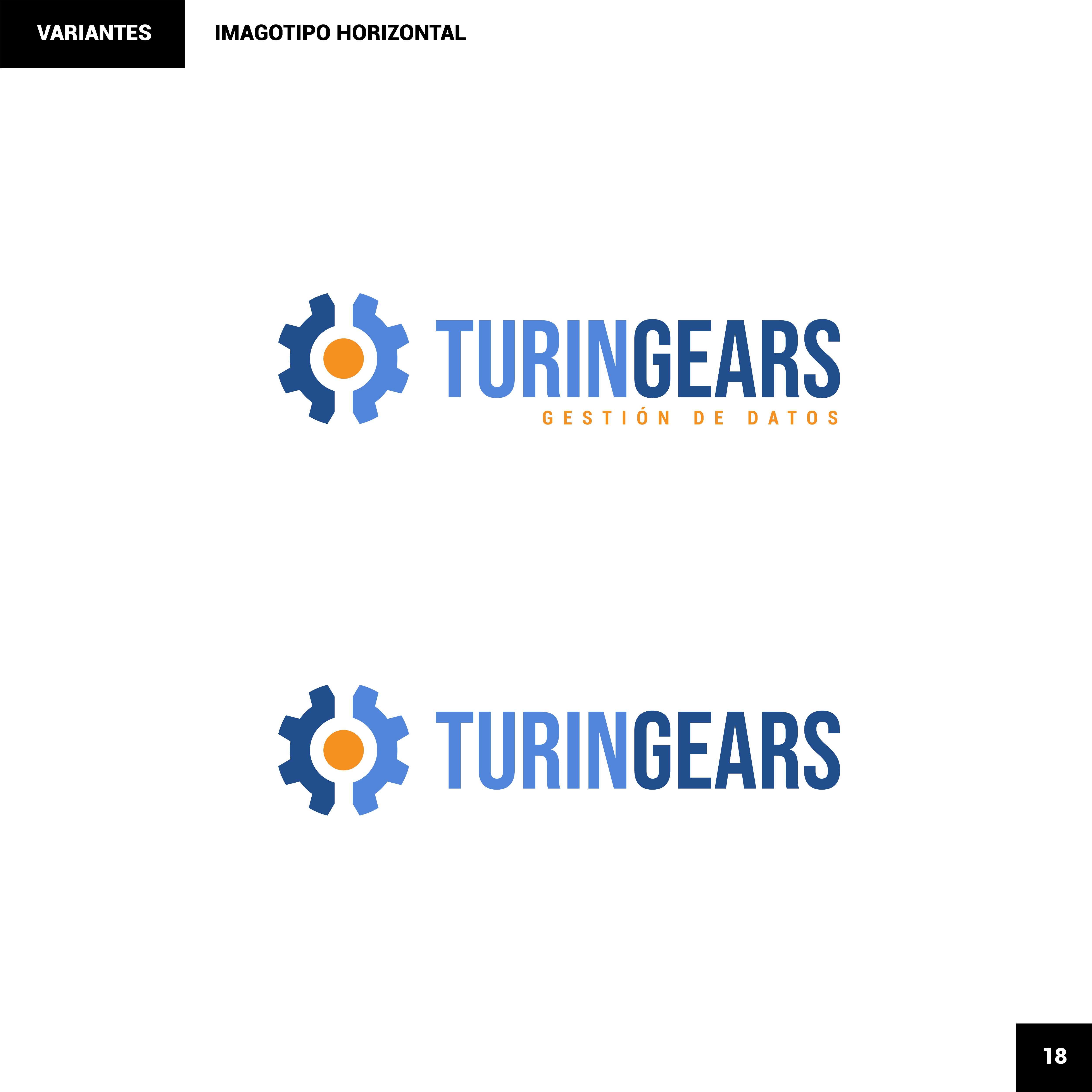
Turingears horizontal logo variants with and without the Gestión de Datos tagline.
Turingears standalone gear isotype in navy, sky blue, and orange.
Turingears incorrect-use grid showing bad colors, layouts, stretches, and effects.
Turingears closing cover with white gear logo over a blue network field and Multitaskers credit.

A logo is just the entry point. A real brand identity is built from a full ecosystem of communicational assets.A brand is built with overall communicational assets.
‍
That includes secondary graphic assets. In this case, a full suite of custom isometric illustrations built specifically for the brand.

Grid of blue-and-orange isometric data and tech icons for Turingears.

Each illustration was designed to communicate complex data concepts in a visual, digestible way, topics that words alone struggle to explain.

Data Protection

Isometric Data Protection scene with padlock, shield, charts, and orange coins.

Cloud Migration

Isometric Cloud Migration scene linking a dashboard monitor to a floating chart platform.

Data Engineering

Isometric Data Engineering scene with a crane building chart platforms and cubes.

Data Governance

Isometric Data Governance hub with a central tower linking charts and checkmark bubbles.

Those same illustrations were then carried into the full website UI design, keeping the visual language consistent from brand guidelines to live product.
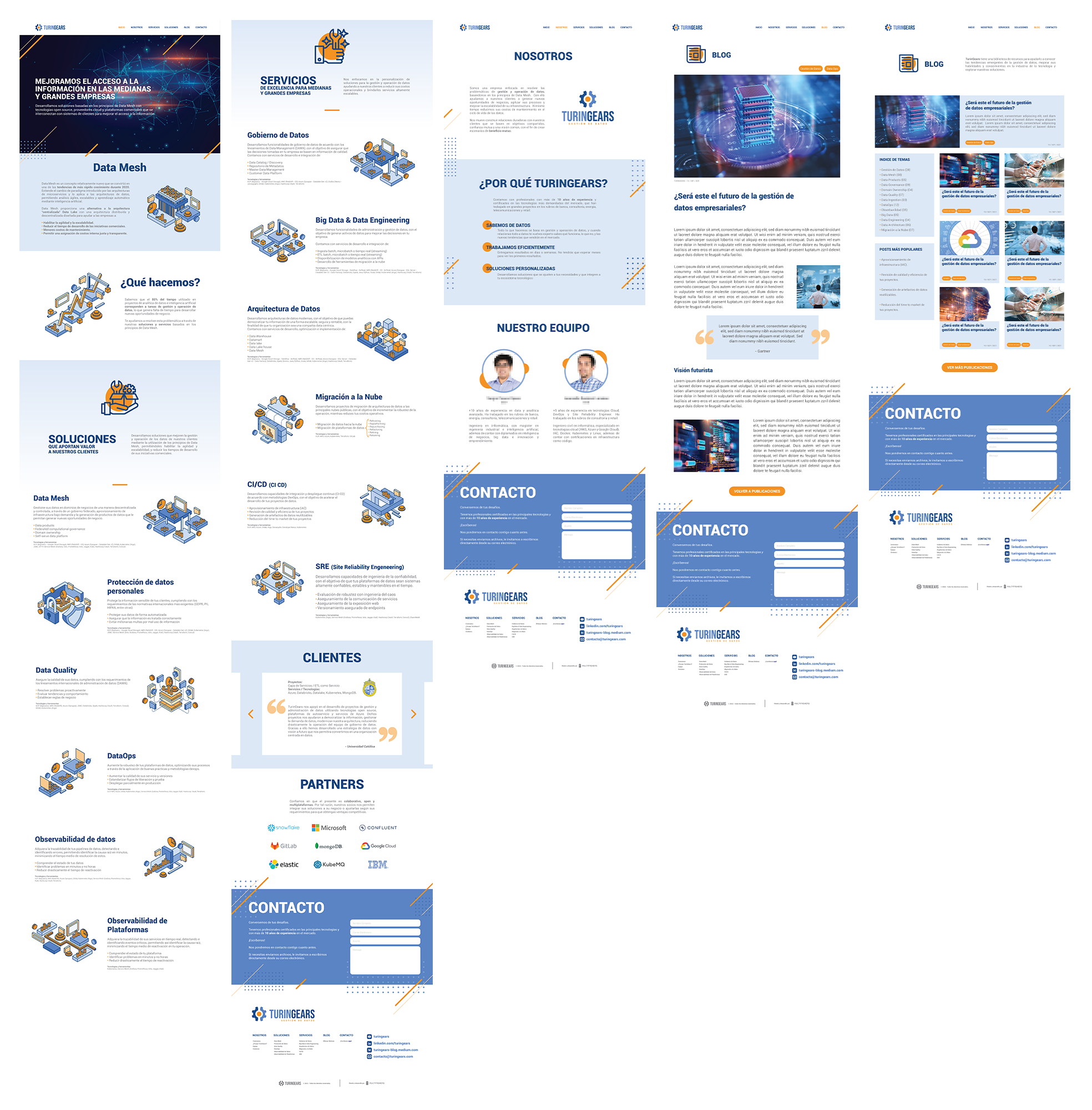
Five long-scroll website mockups for the Turingears data brand.

Alright, this doesn't feel like
"just a logo" anymore

Turingears logo with split blue gear icon and orange center on black.

Same name. Same concept. Completely different presence.
That's the difference between a logo and a brand identity, one is a symbol, the other is a system.
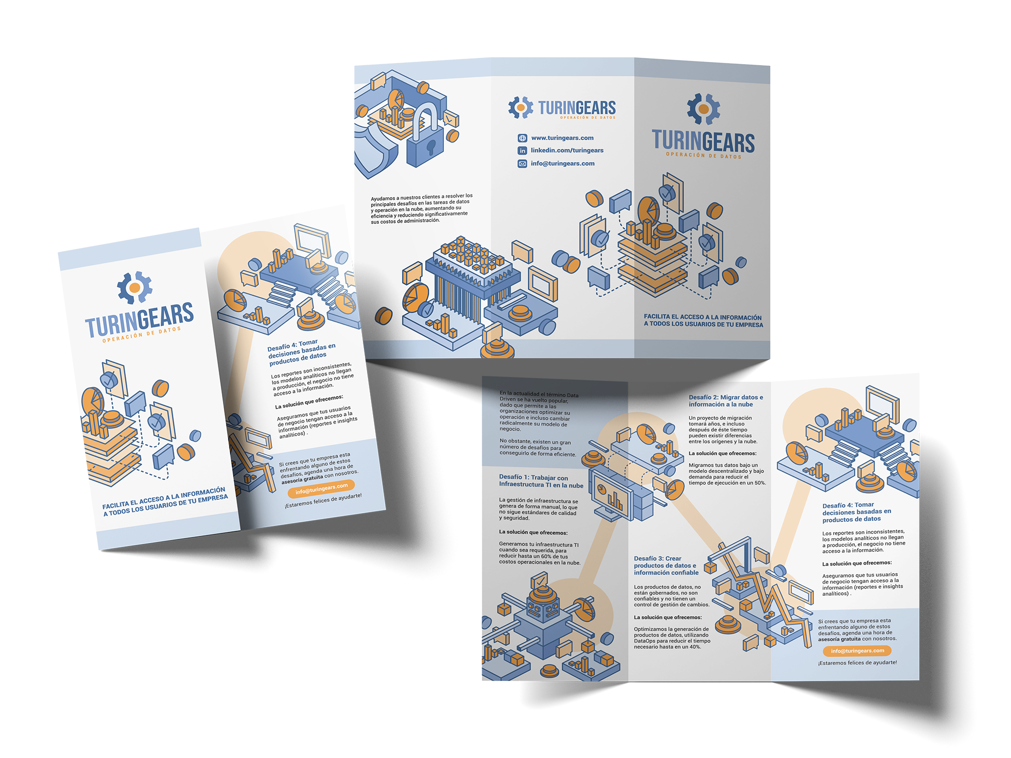
Turingears trifold brochure mockups showing cover and interior panels.

A brand is static. It's what you have.
Branding is dynamic, it is how you use what you have.

Other Case Studies

Same process, different worlds.

Multitaskers / Creative Agency
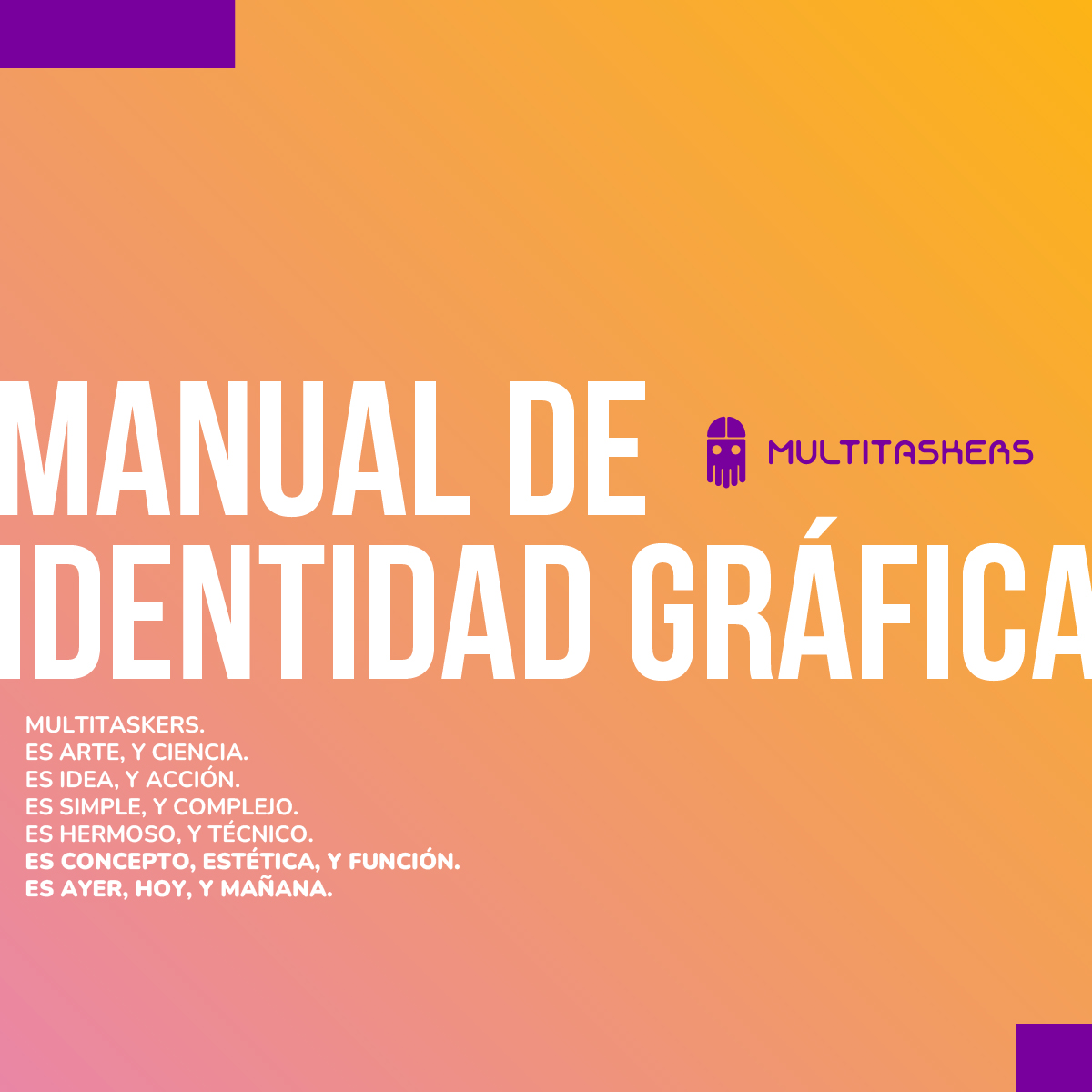
Multitaskers graphic identity manual cover on an orange-to-pink gradient.
Multitaskers brand-manual table of contents page labeled Índice.
Multitaskers brand-manual Introducción page explaining brandbook and identity manuals.
Multitaskers Libro de Marca section opener on purple with yellow title and Spanish brandbook text.
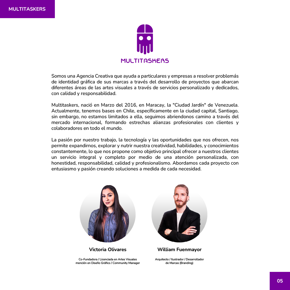
Multitaskers agency intro with purple logo and founder portraits of Victoria and William.
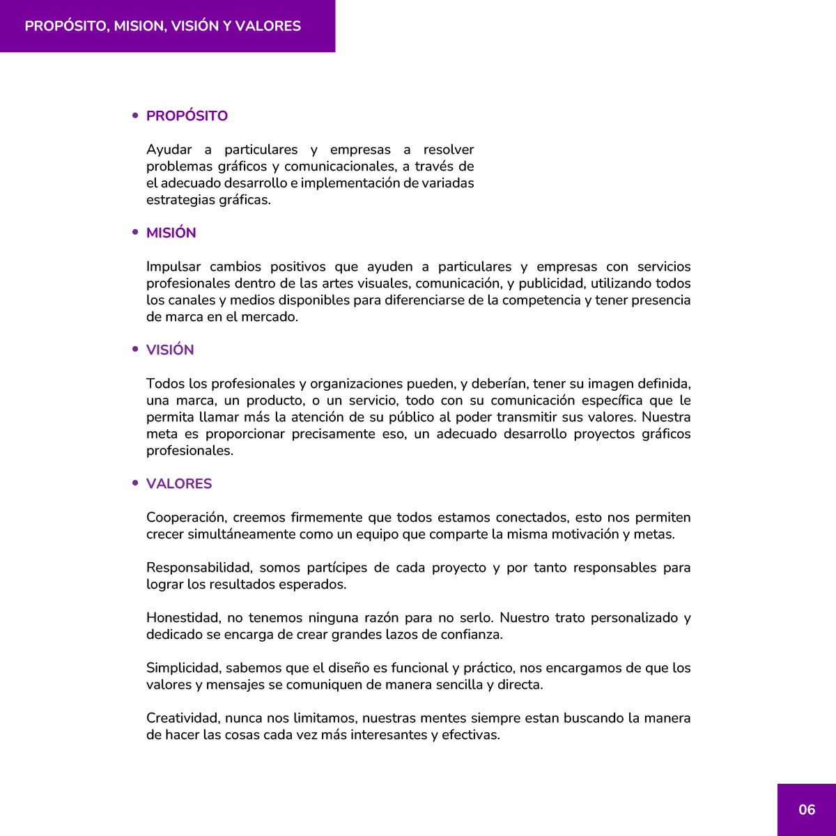
Multitaskers purpose, mission, vision, and values page with purple bullet sections.
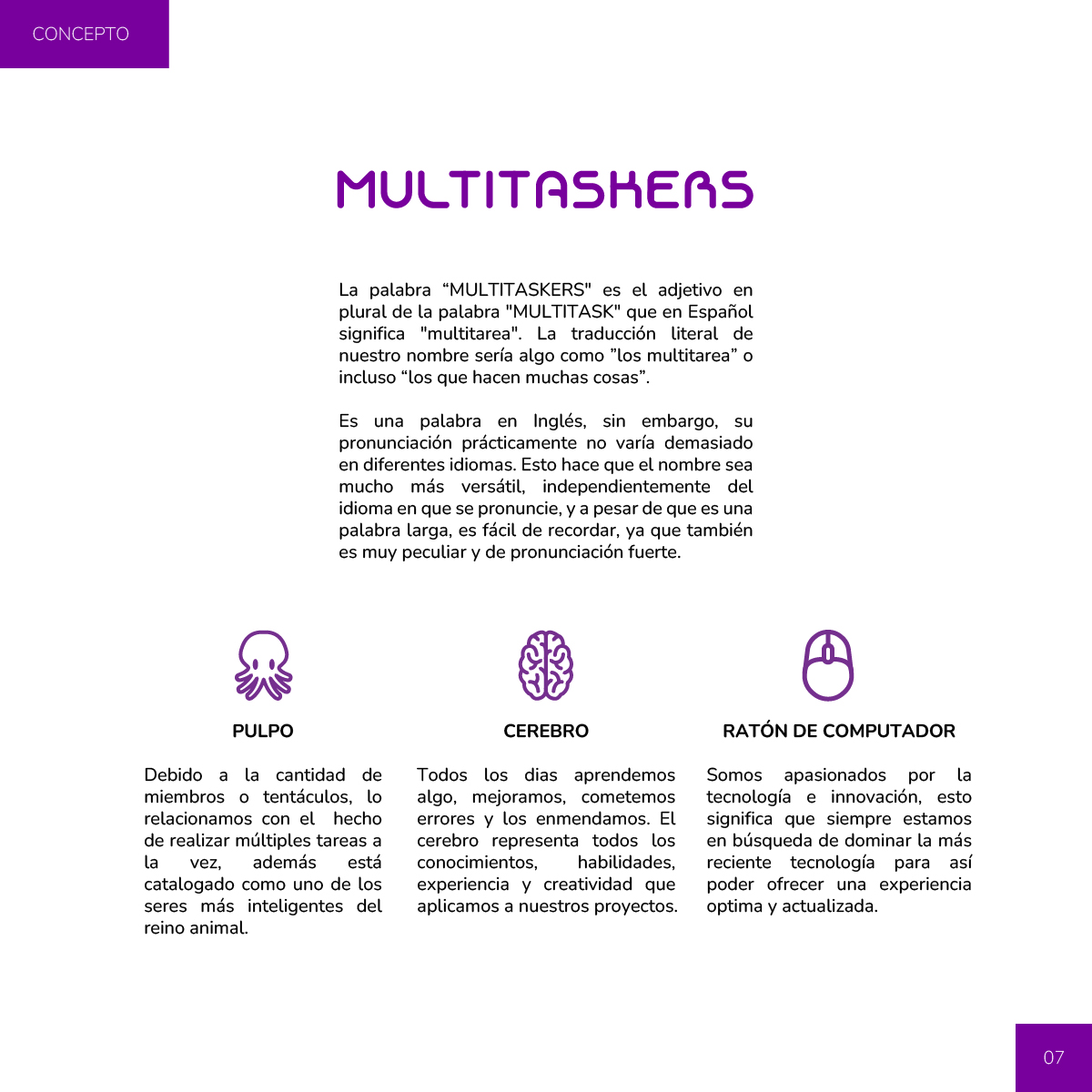
Multitaskers concept page with octopus, brain, and computer-mouse icons explaining the name.
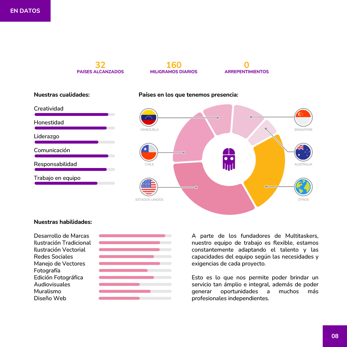
Multitaskers En Datos infographic with country chart, qualities bars, and skills bars.
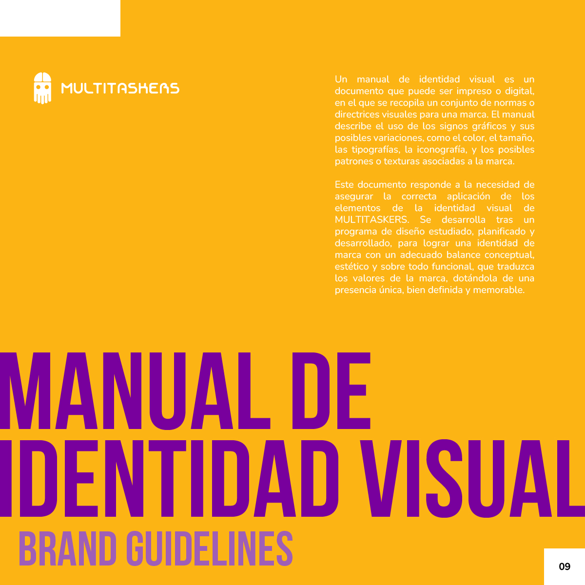
Multitaskers Manual de Identidad Visual section opener on yellow-orange with purple title.
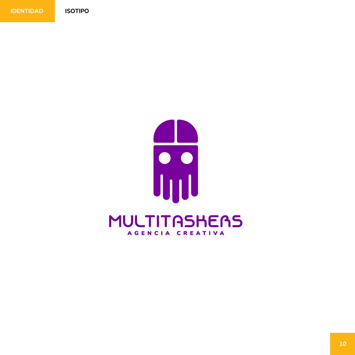
Multitaskers purple logo lockup with mascot mark, wordmark, and Agencia Creativa tagline.
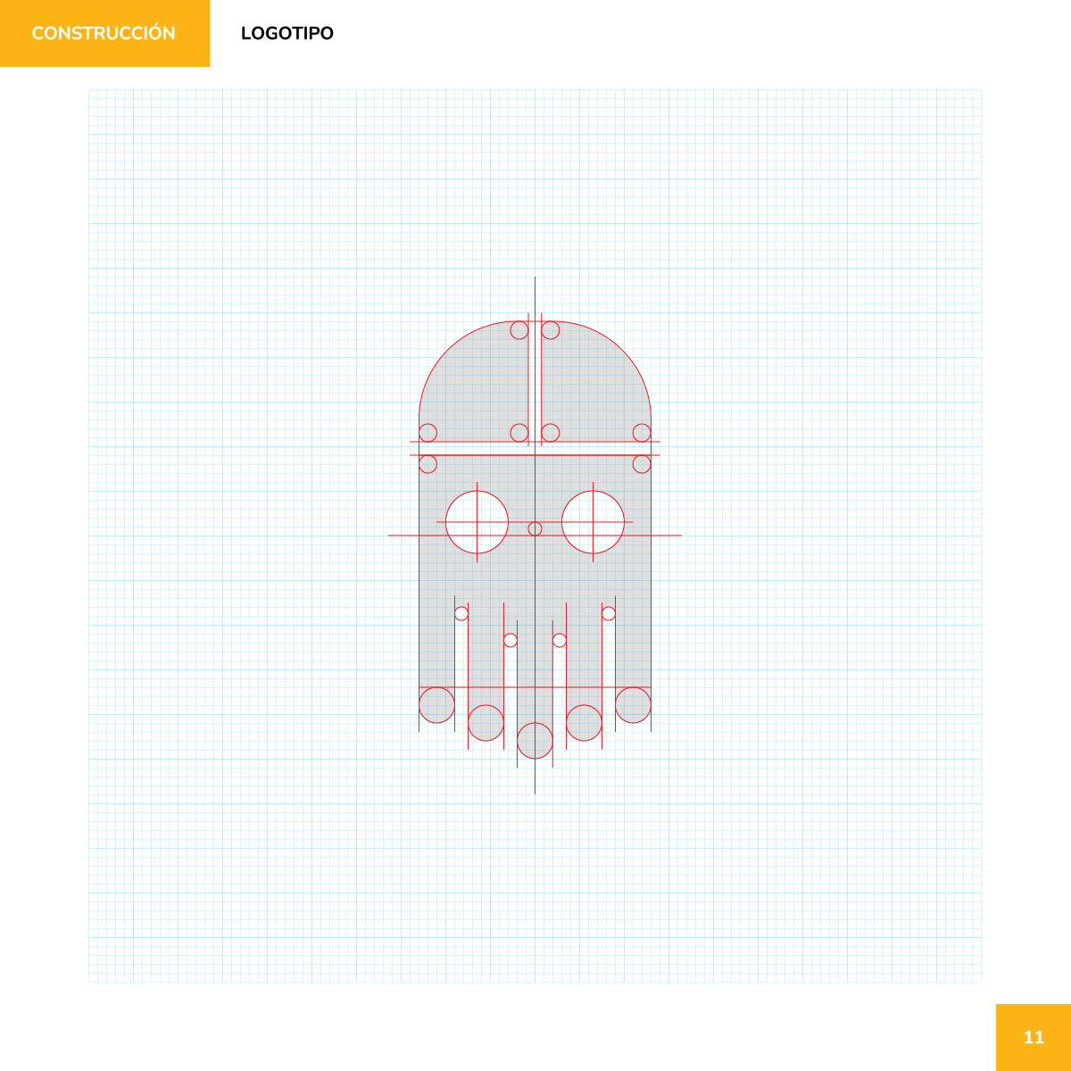
Multitaskers mascot mark construction on a grid with red geometric guides.
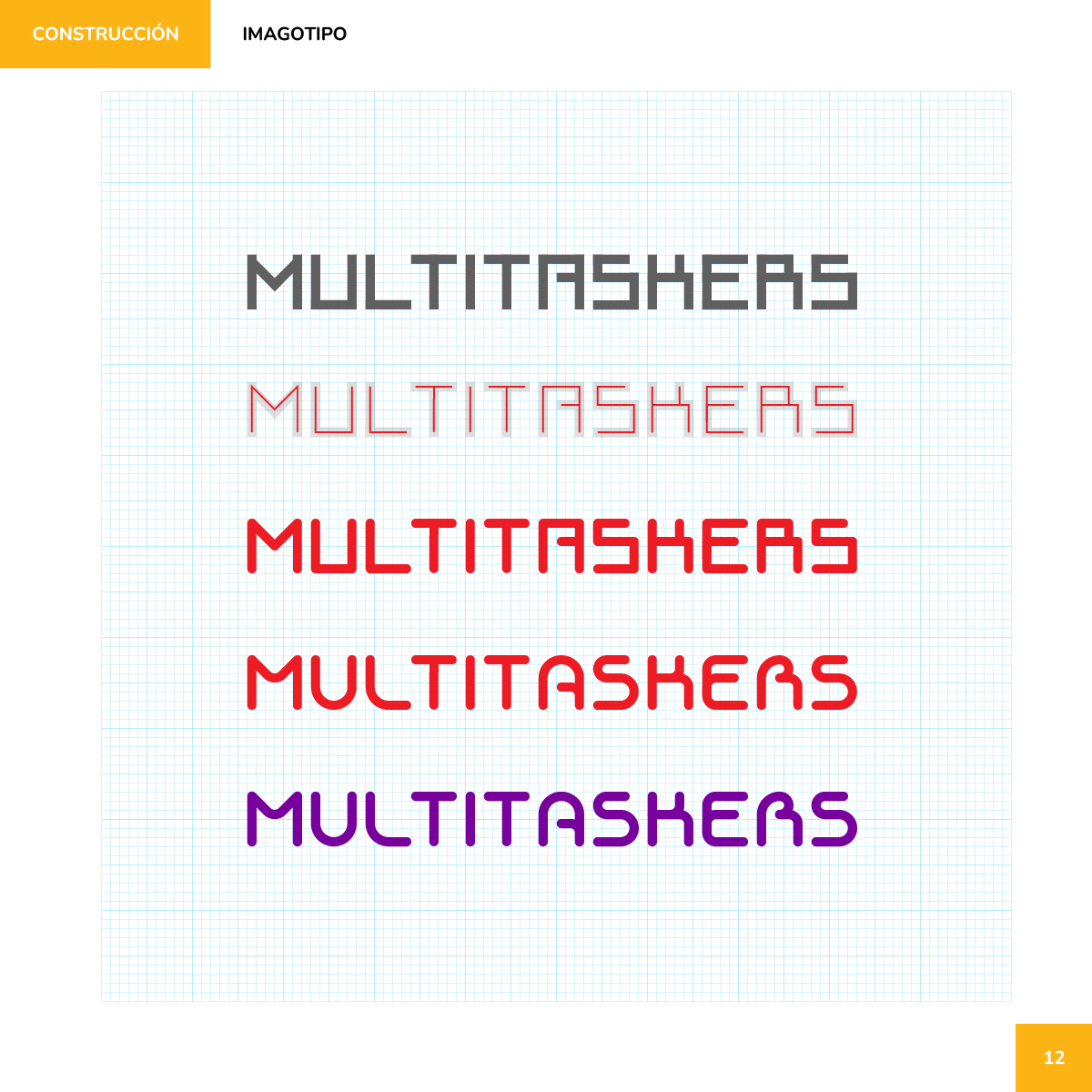
Multitaskers wordmark construction steps from sharp black letters to rounded purple final.
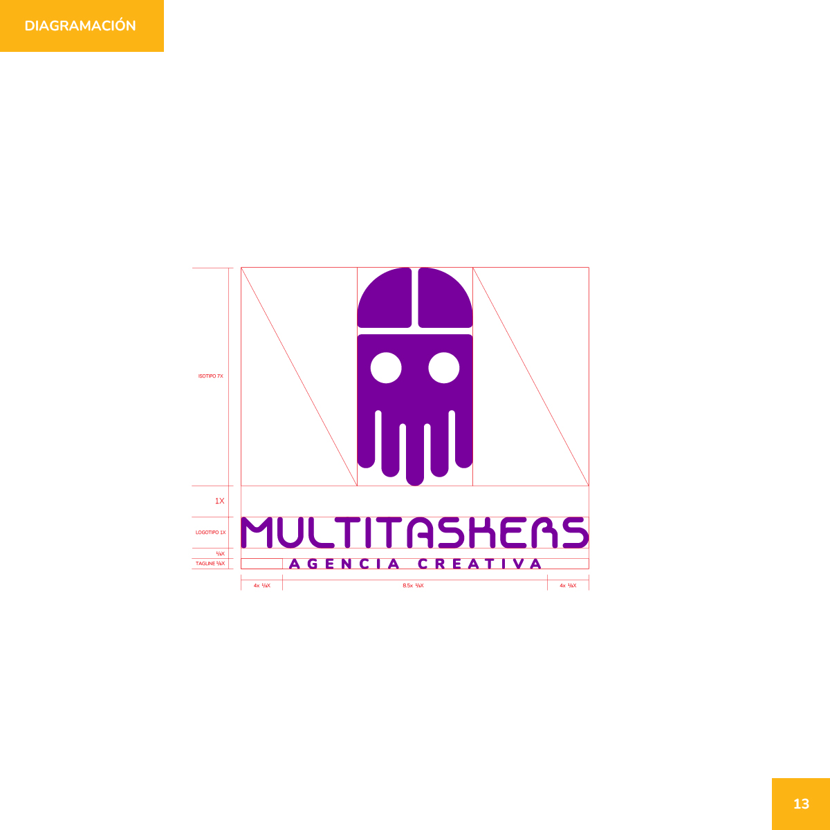
Multitaskers logo diagramming with pink spacing guides around mark, name, and tagline.
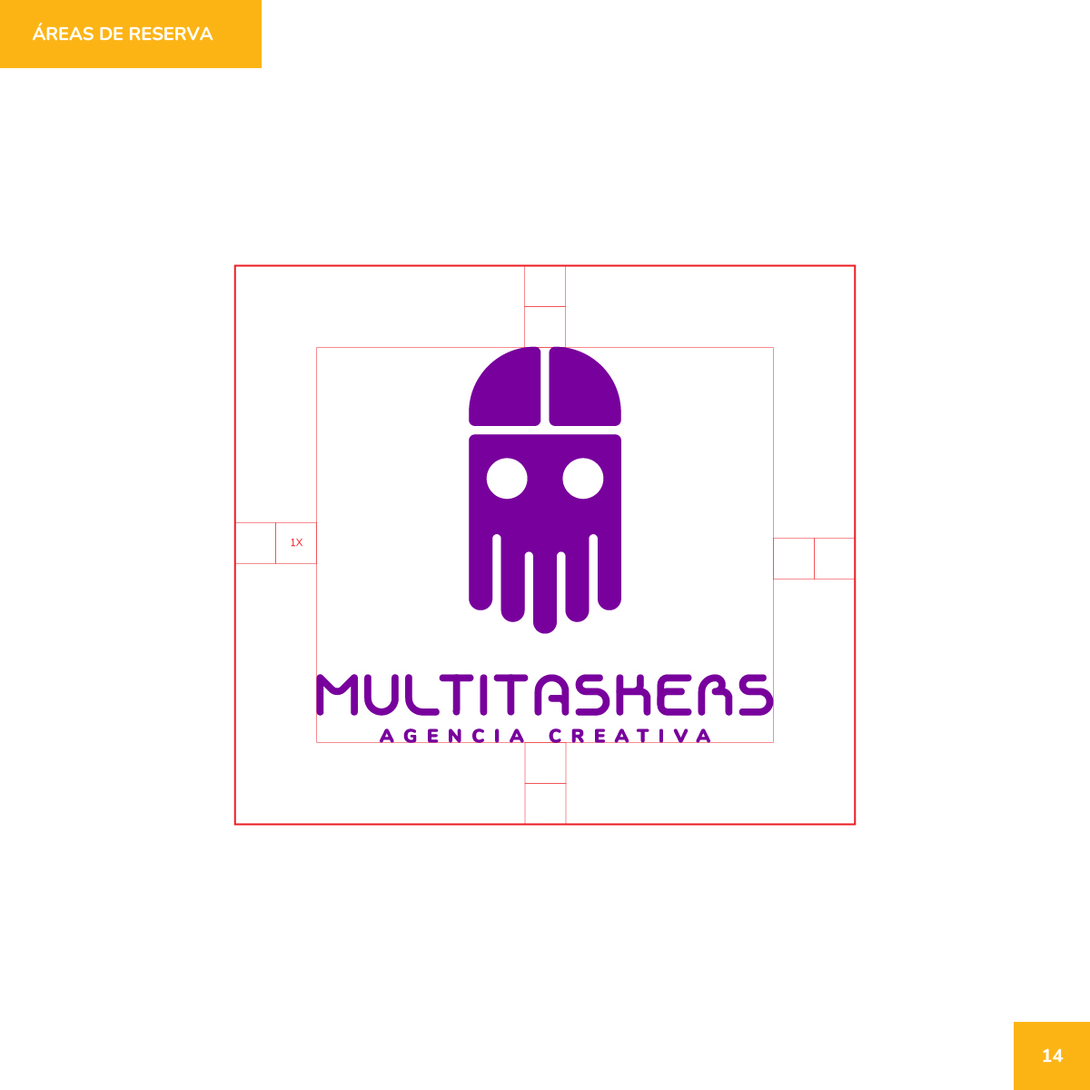
Multitaskers clear-space diagram with 1X reserve area around the full logo lockup.
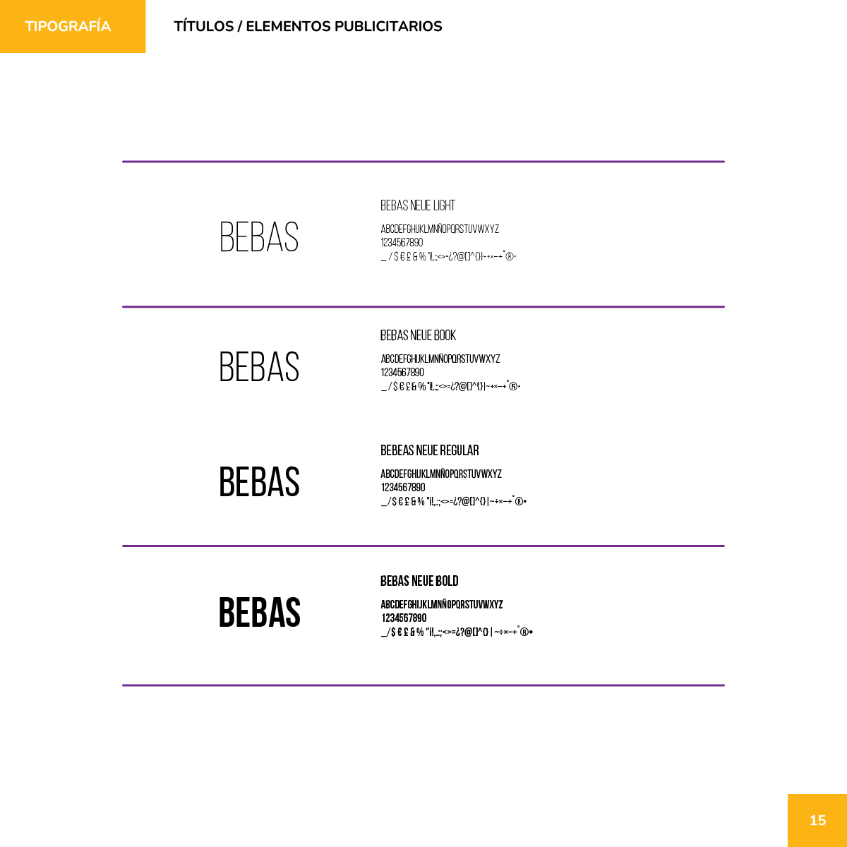
Multitaskers typography page showing four Bebas Neue weights for titles and ads.
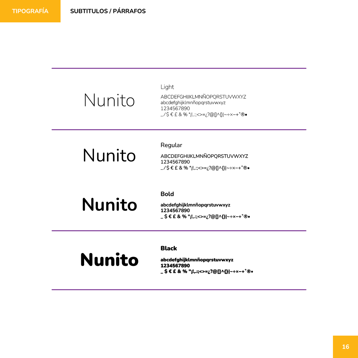
Multitaskers typography page showing four Nunito weights for subtitles and body text.
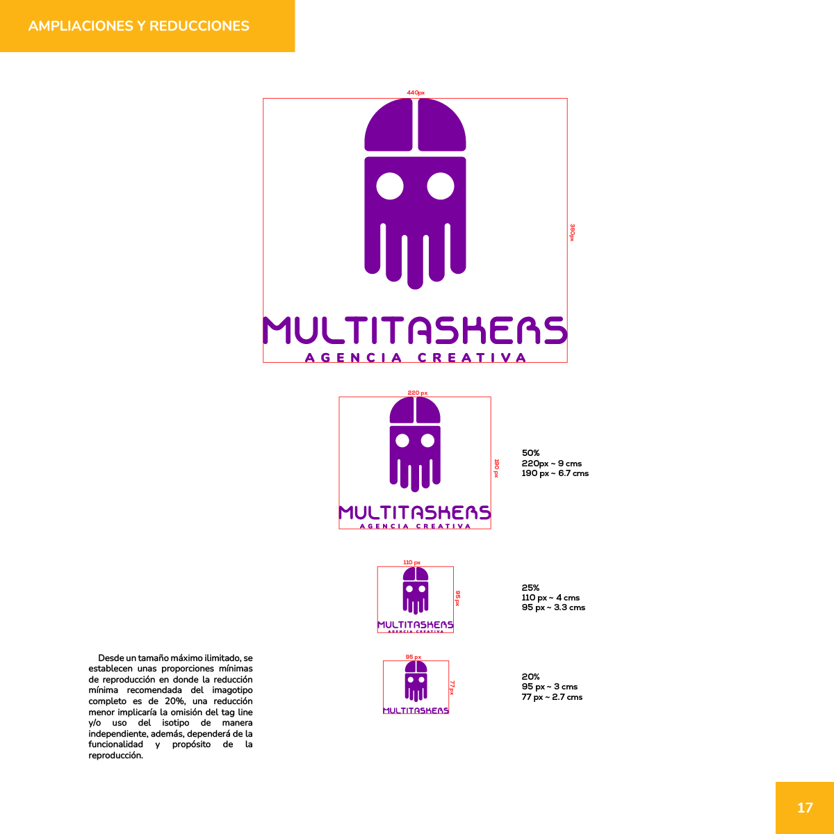
Multitaskers logo scale guide with 50%, 25%, and 20% minimum reproduction sizes.
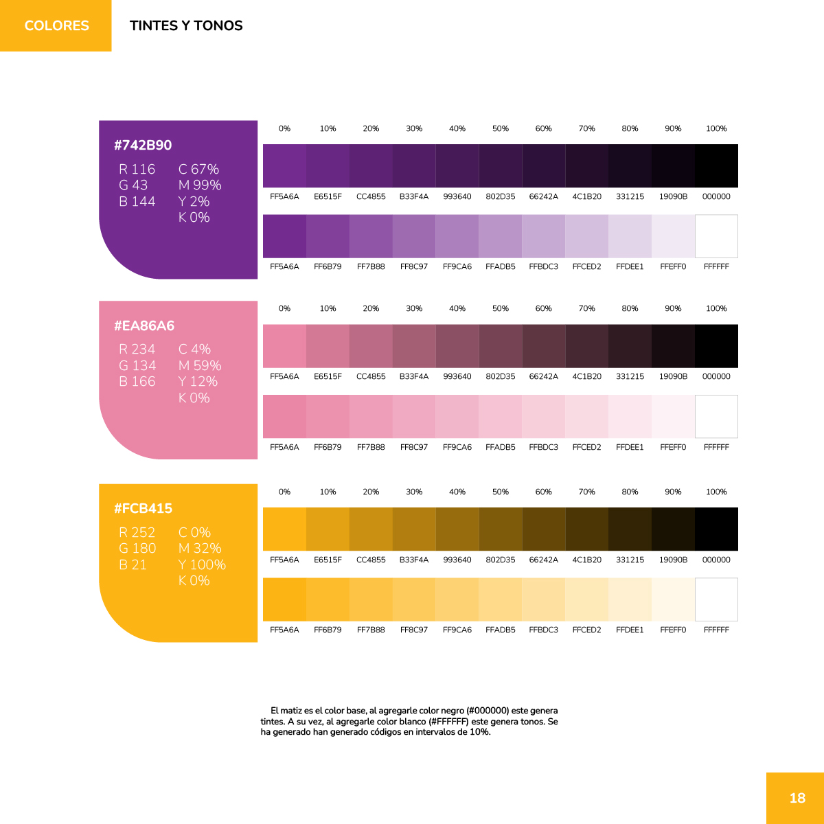
Multitaskers color page with purple, pink, and yellow tint and tone scales.
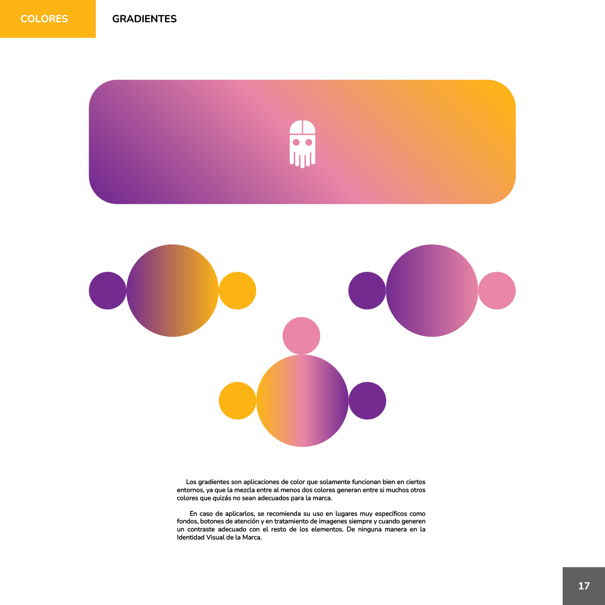
Multitaskers gradients page with purple-to-yellow bar and circular sample compositions.
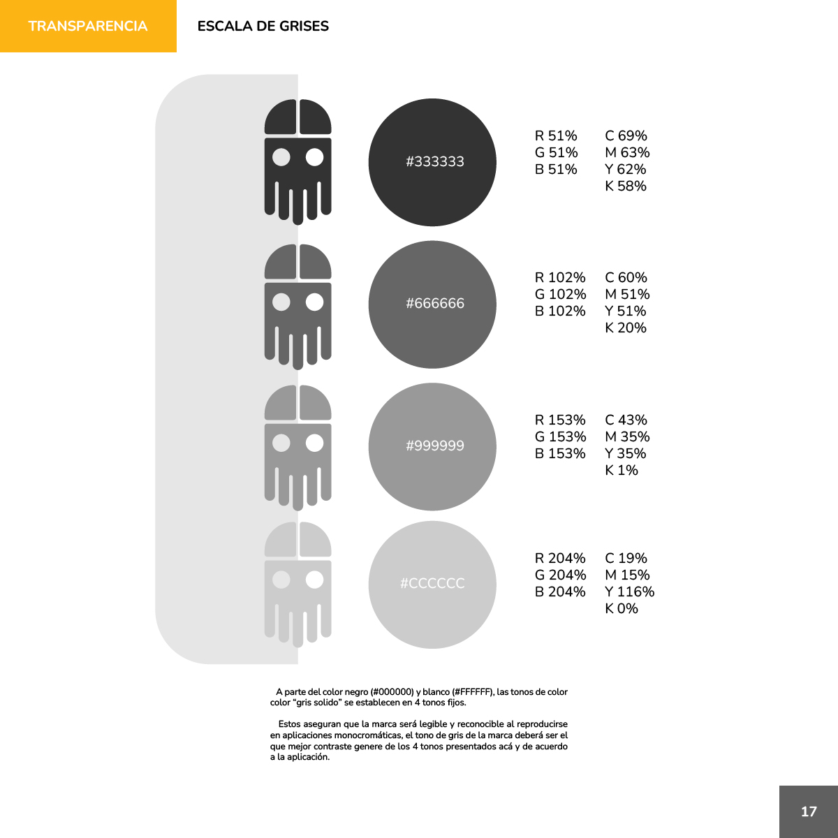
Multitaskers grayscale page with four gray swatches and matching mascot marks.
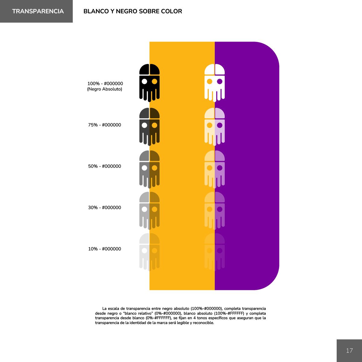
Multitaskers black and white logo opacity steps on yellow and purple color grounds.
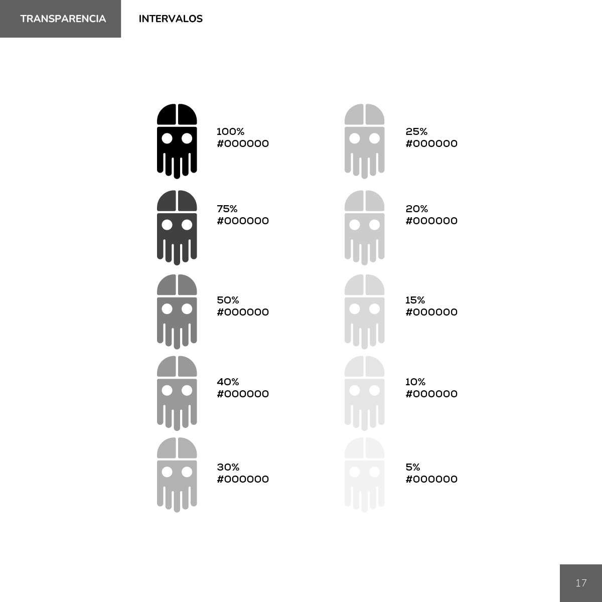
Multitaskers black logo opacity interval chart from 100% down to 5%.
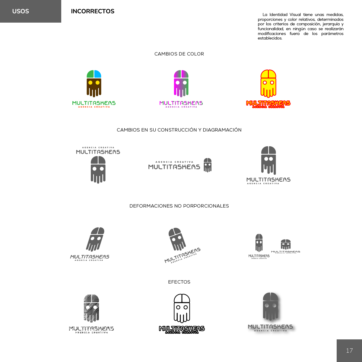
Multitaskers incorrect-use grid showing bad colors, layouts, stretches, and effects.
Multitaskers Identidad Corporativa section opener on pink with purple title text.

Barkmeta / Personal Branding
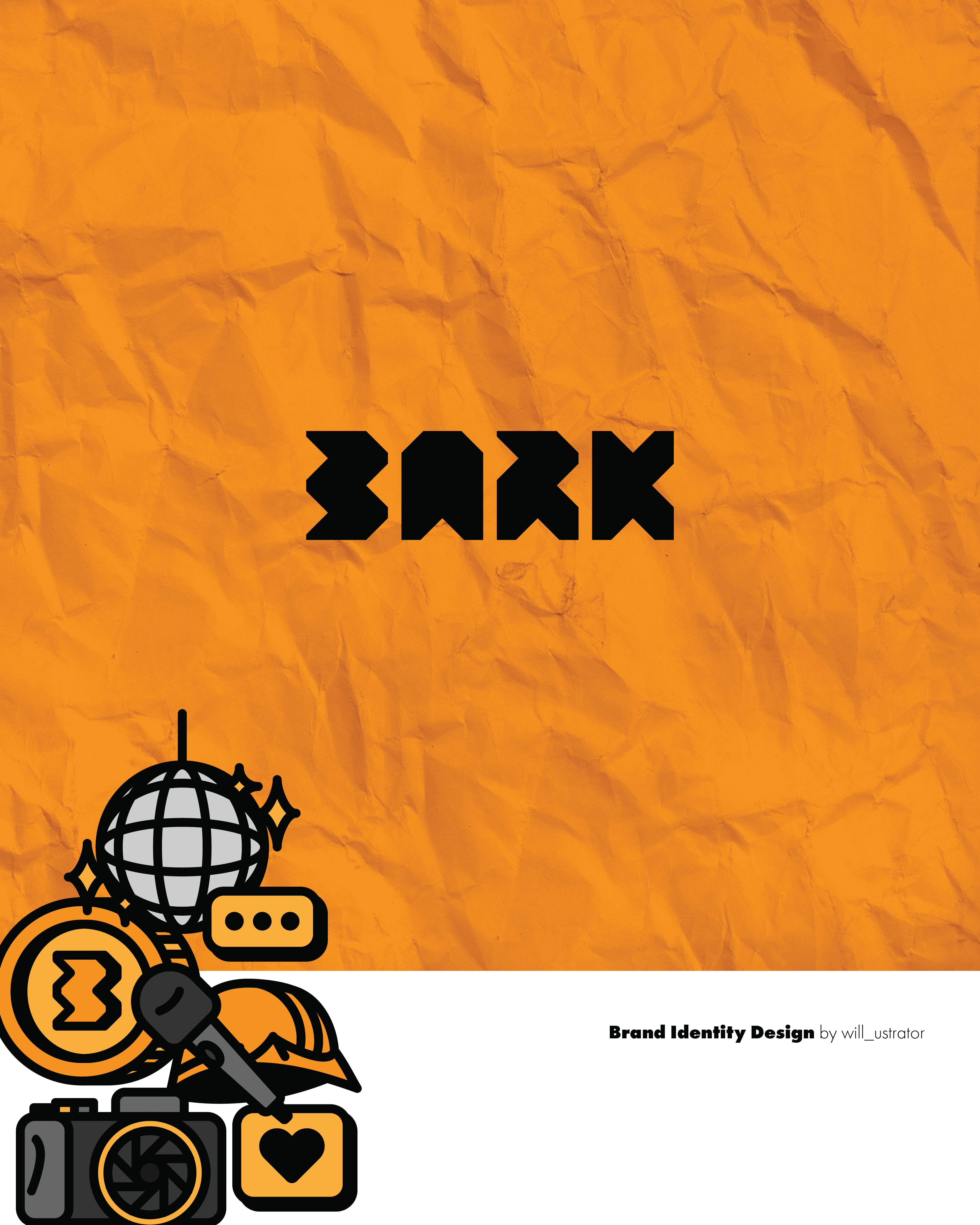
3ARK wordmark on crumpled orange paper with a cluster of brand icons below.
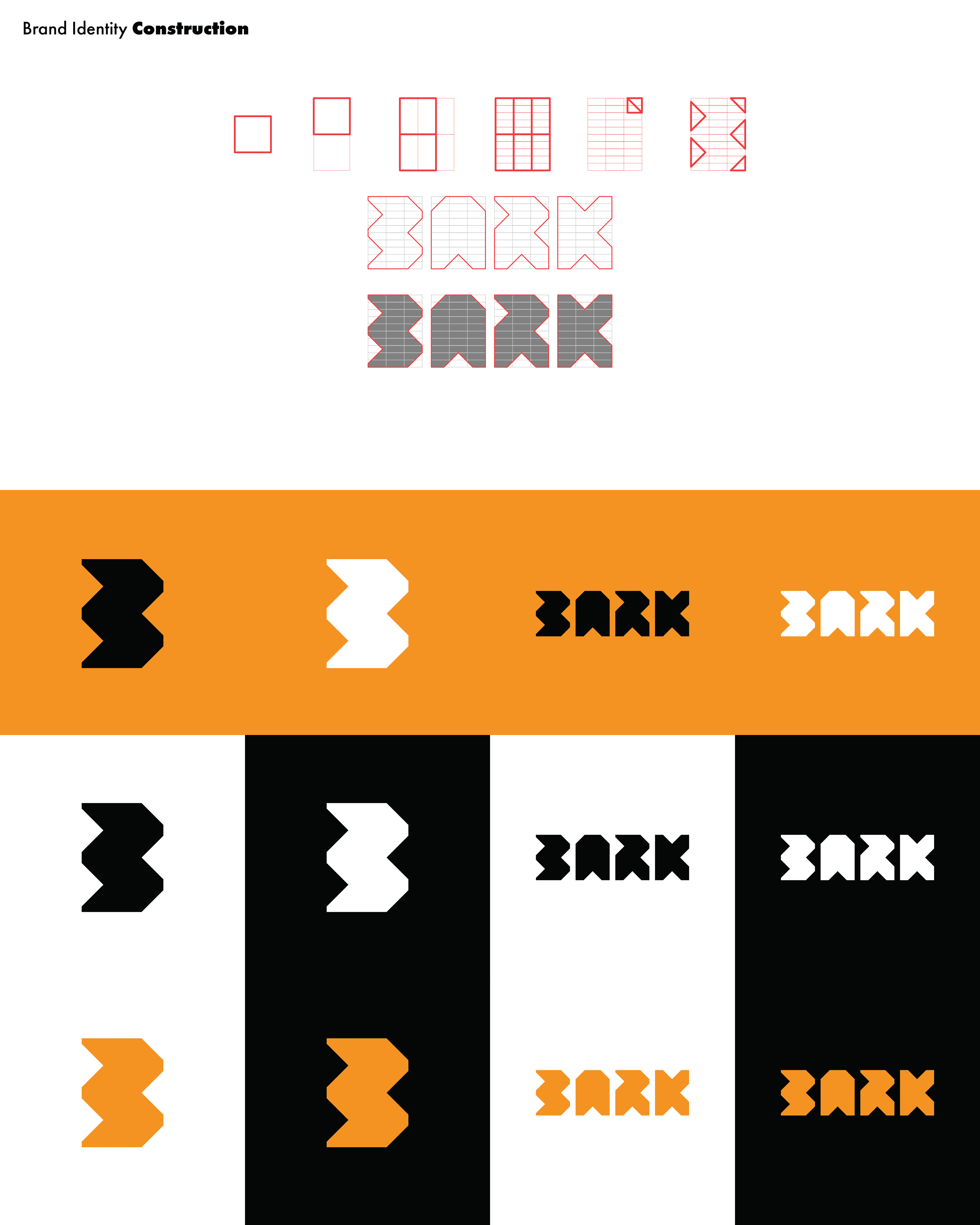
BARK logo construction grids and black, white, and orange wordmark lockups.
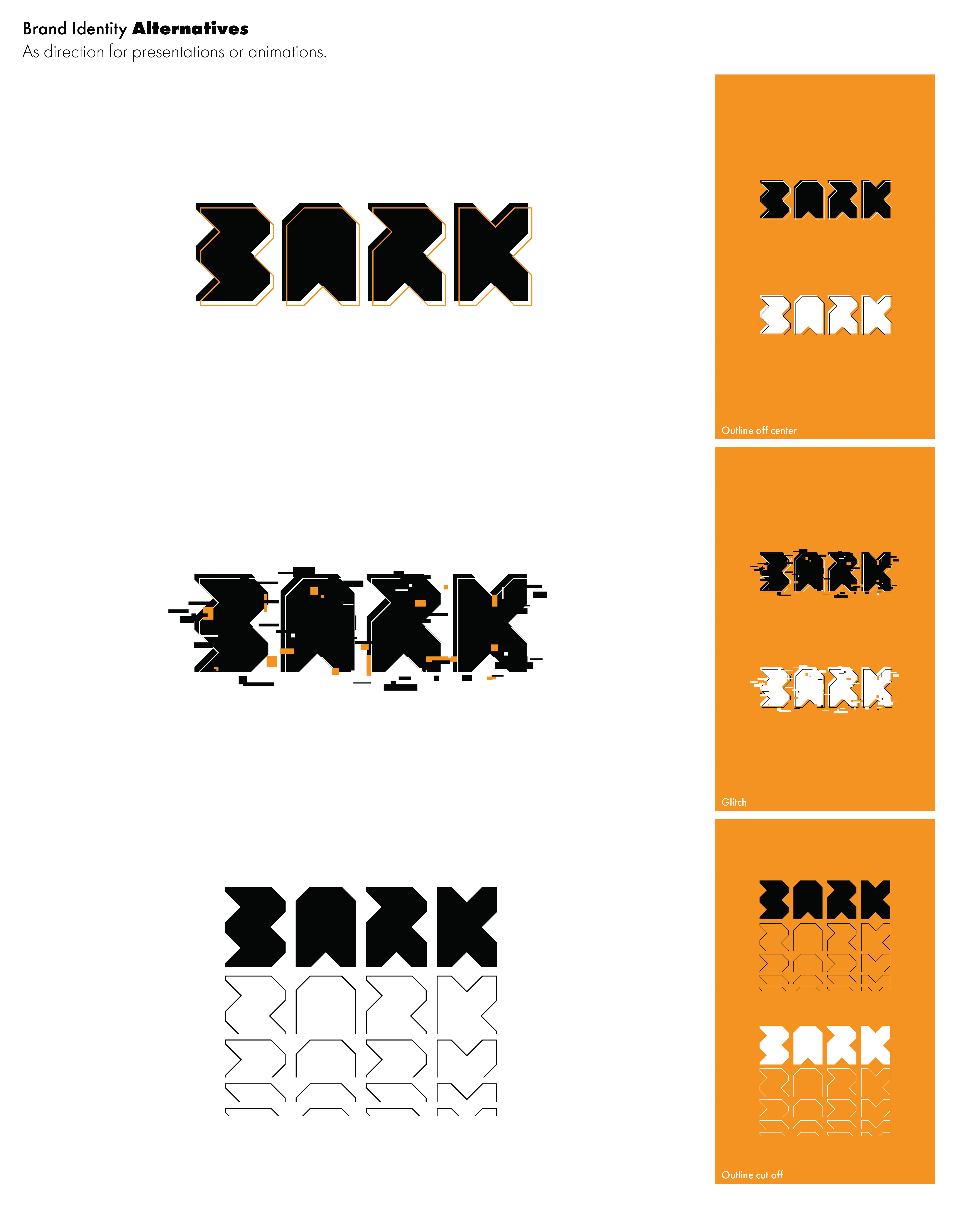
BARK logo alternatives with outline, glitch, and stacked outline motion effects.
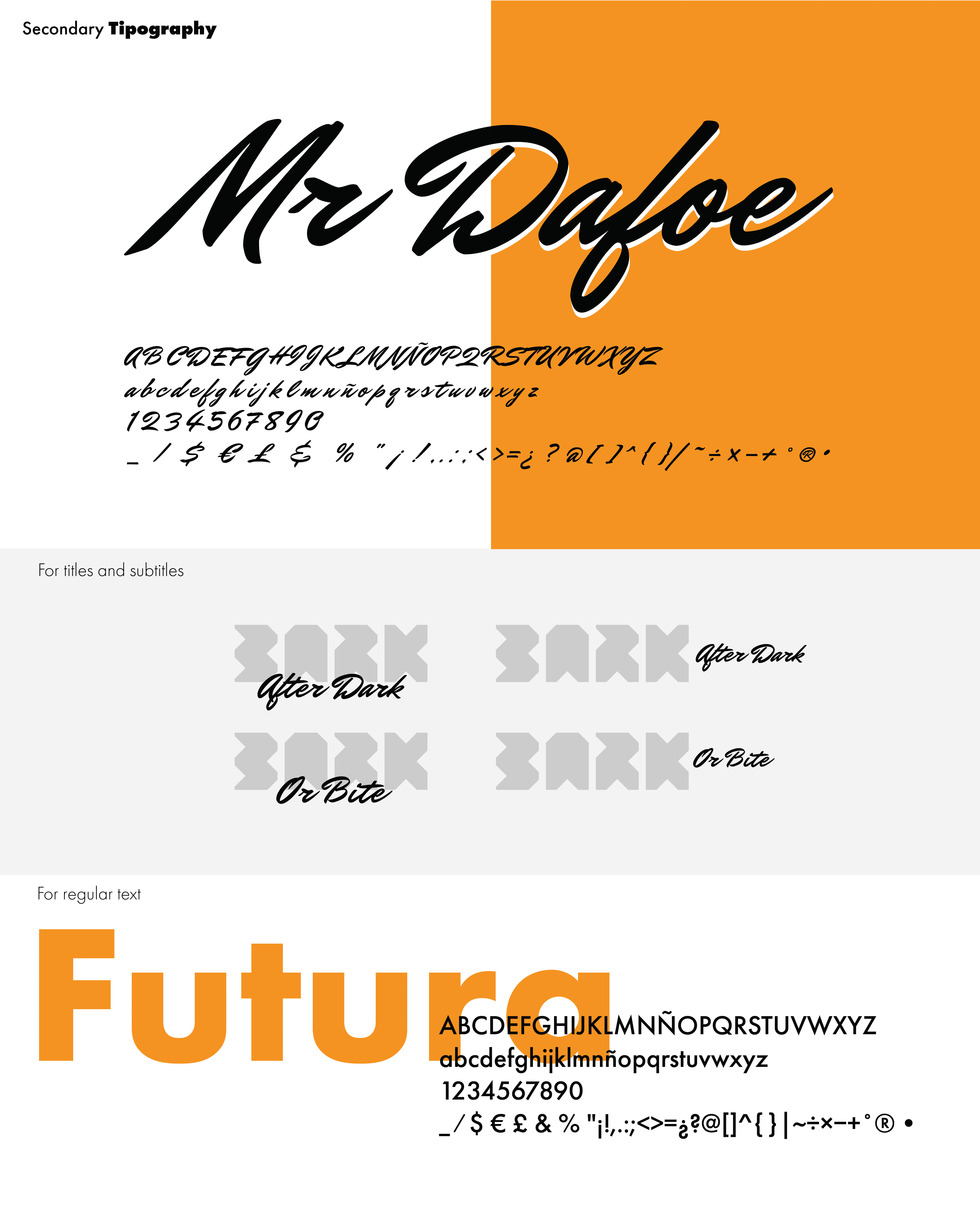
BARK secondary typography showing Mr Dafoe script and Futura for titles and body.
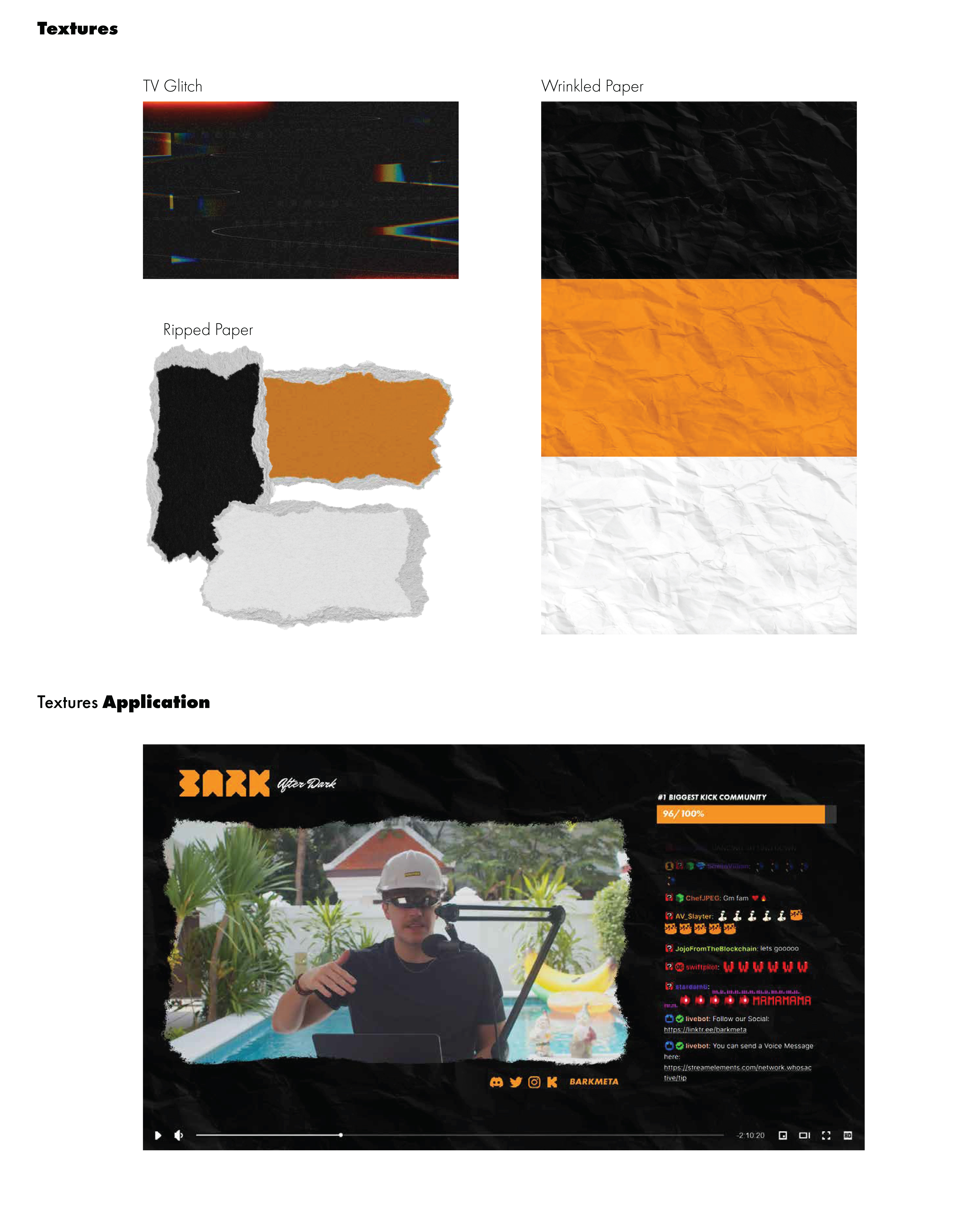
BARK texture samples and After Dark stream overlay with torn-paper video frame.
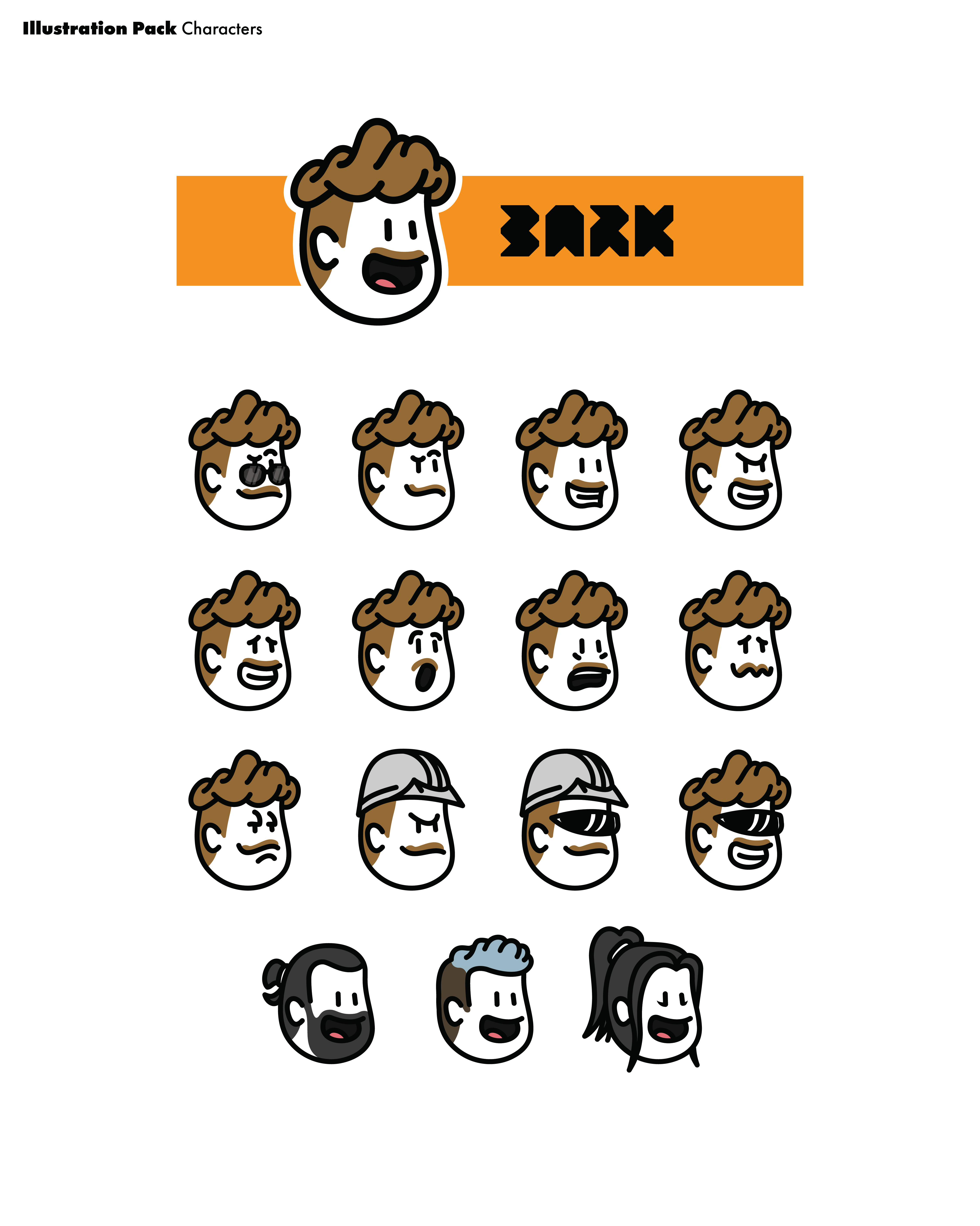
BARK character illustration pack with expression variants and three companion faces.
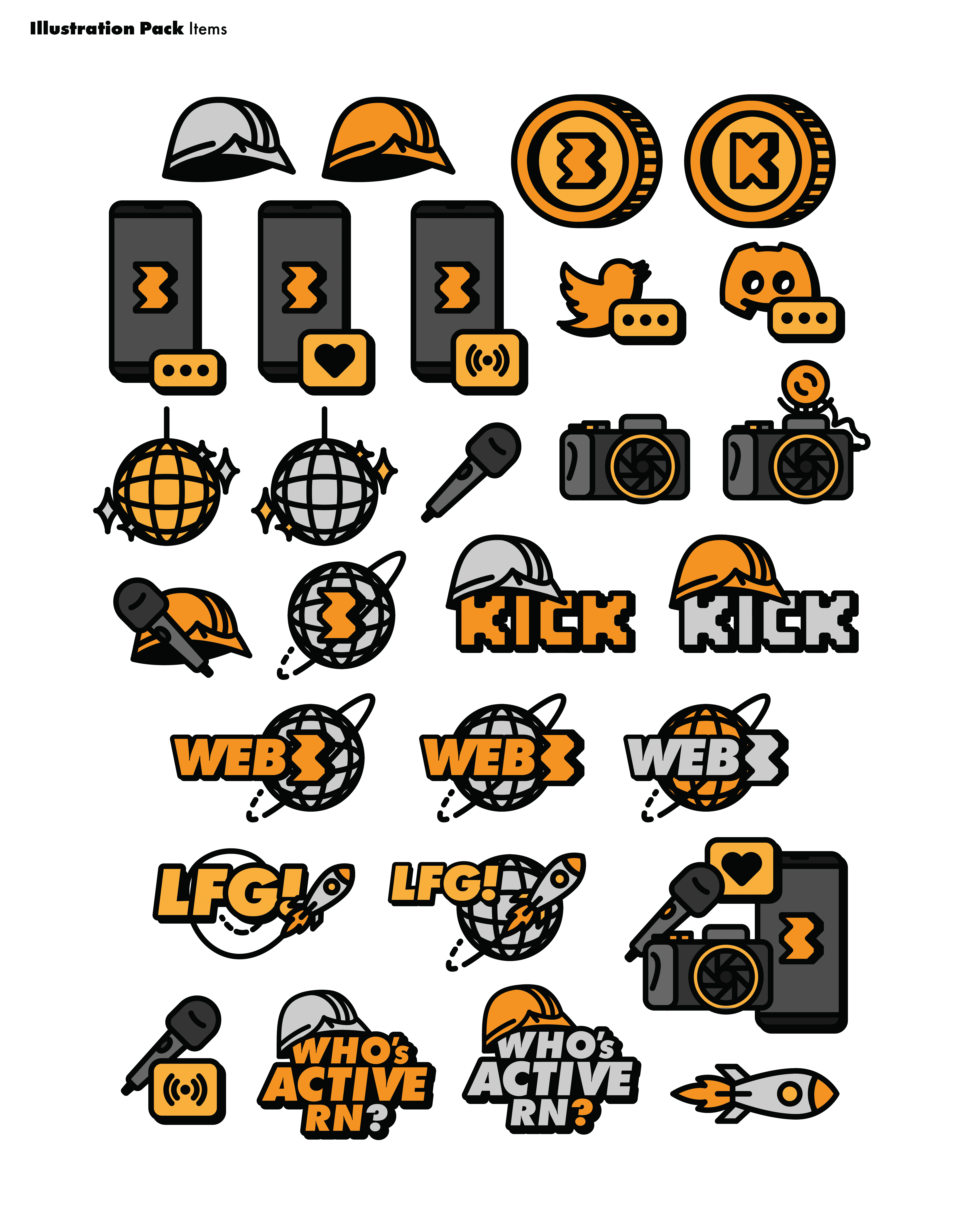
BARK orange-and-black sticker pack with phones, hard hats, Kick, Web3, and LFG icons.
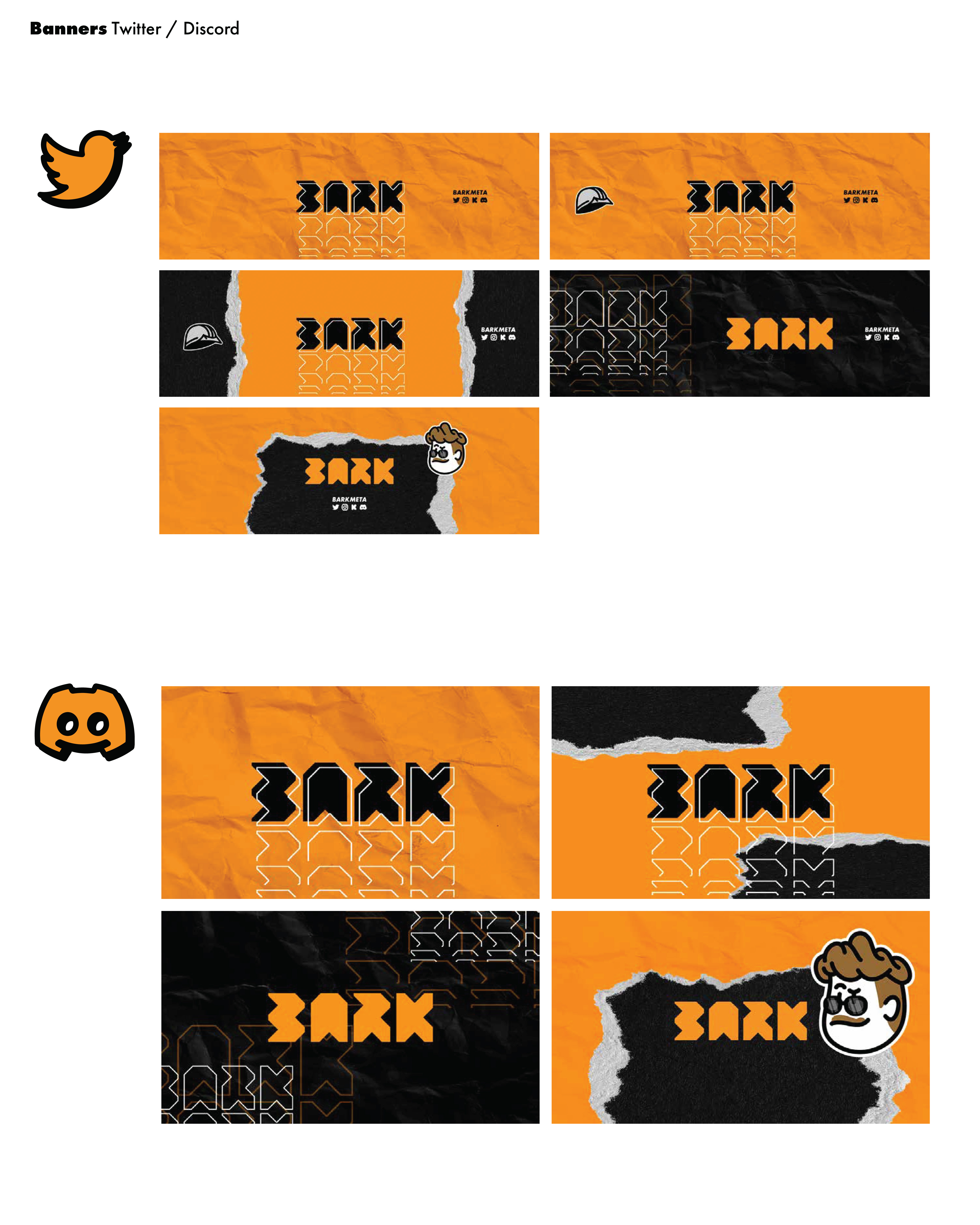
BARK Twitter and Discord banner set on crumpled orange and black paper textures.
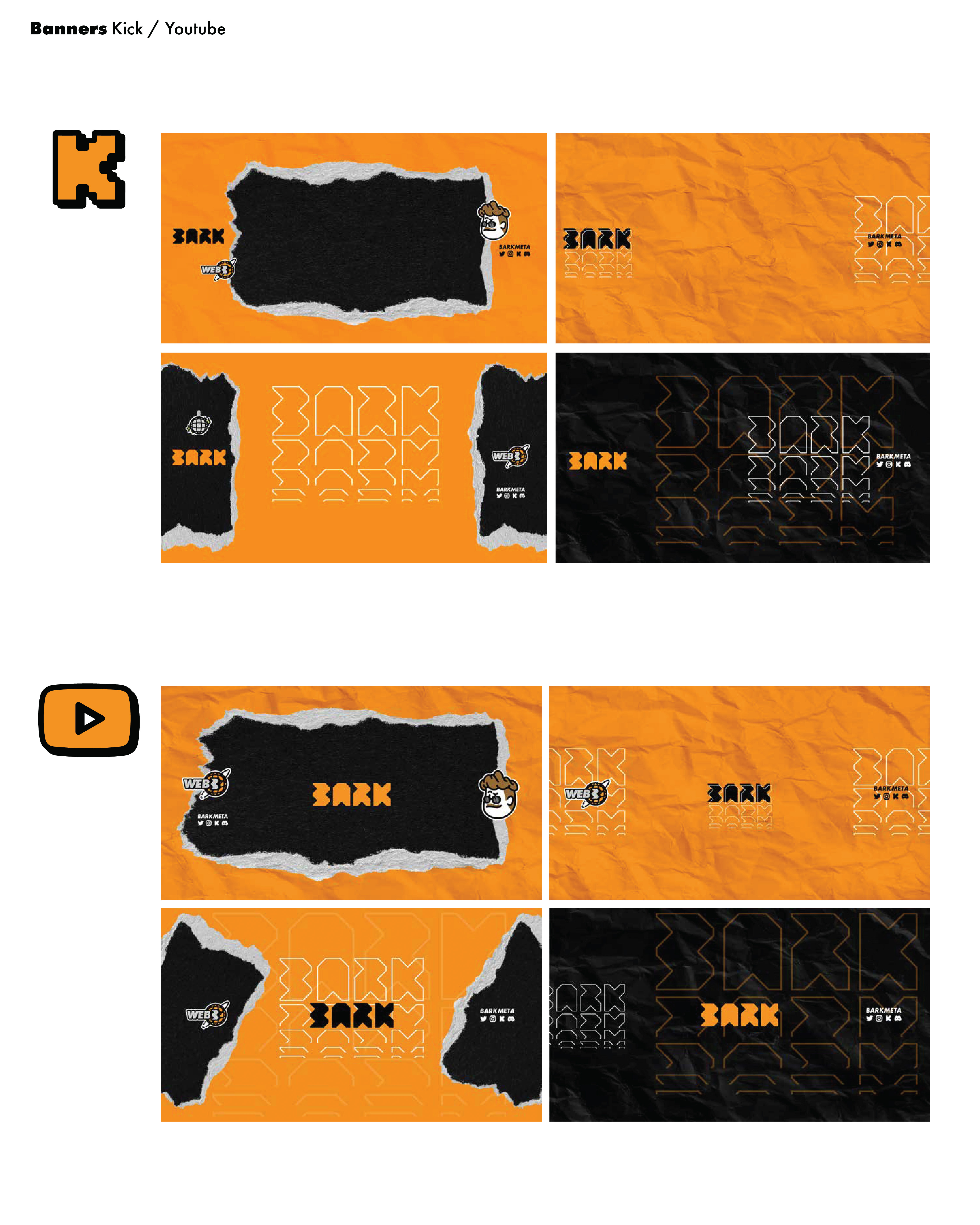
BARK Kick and YouTube banner set with torn-paper frames and orange wordmarks.
BARK orange wordmark on crumpled black paper with will_ustrator credit footer.

Lighthouse Lids / Premium Hats
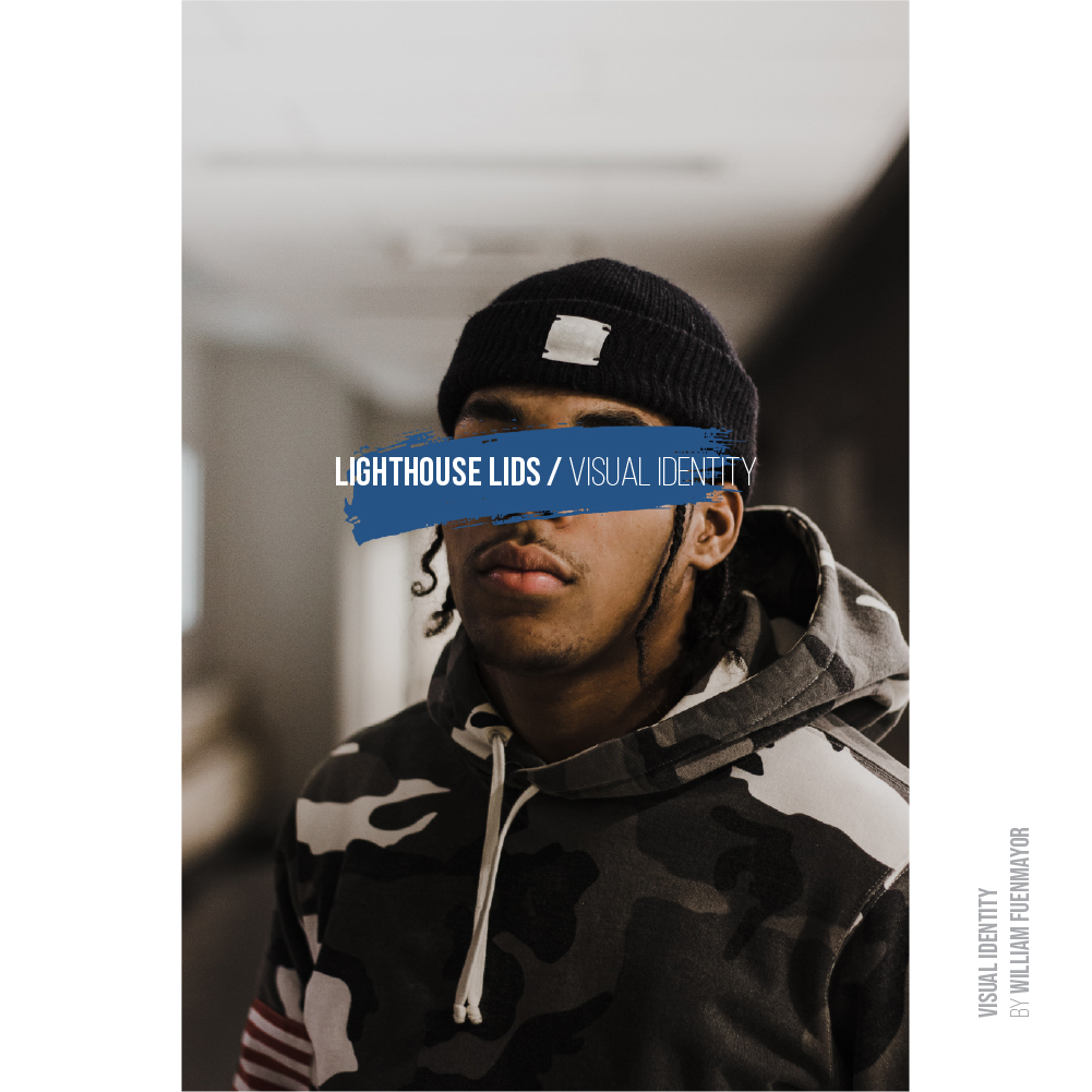
Lighthouse Lids visual identity cover with model in beanie behind a blue eye bar.
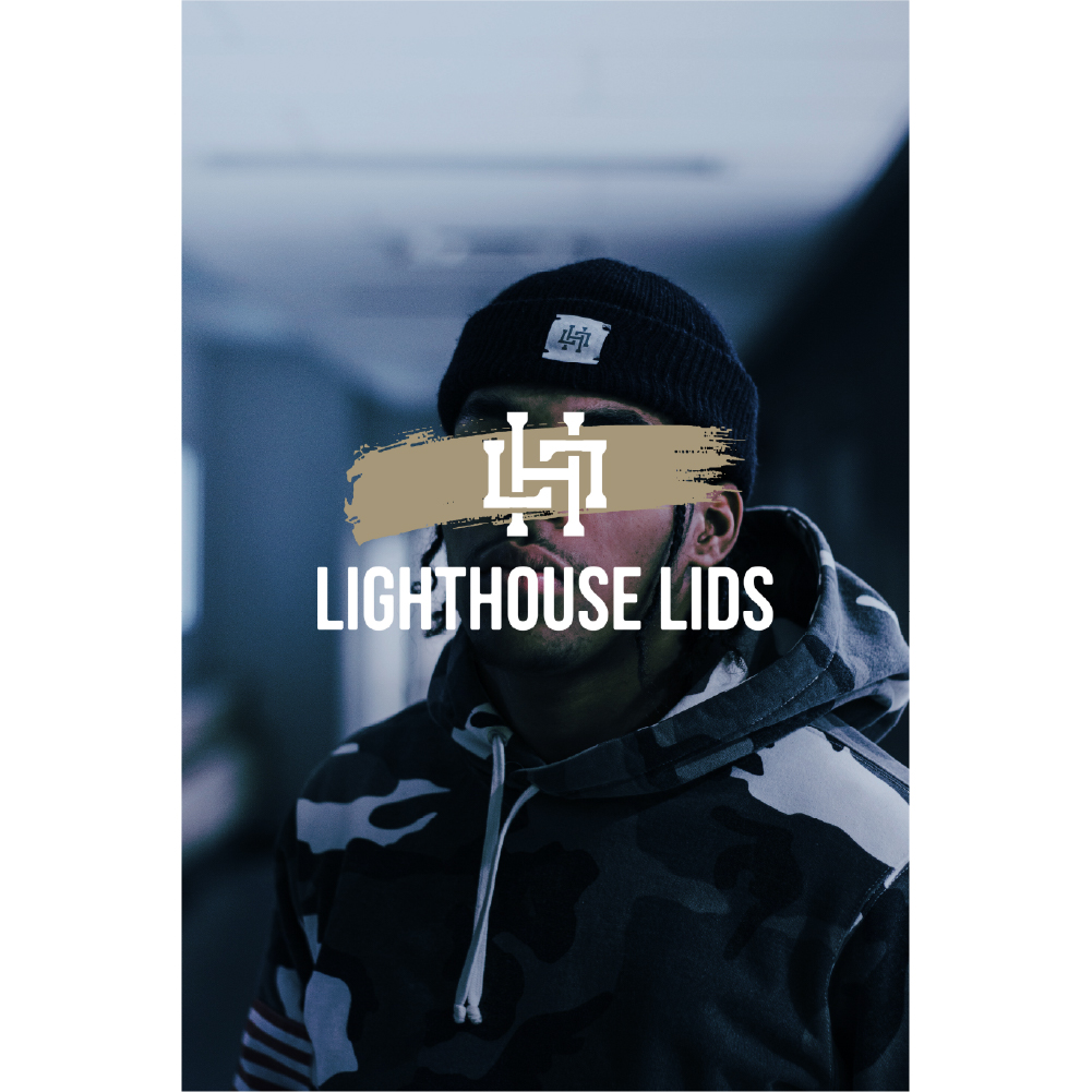
Lighthouse Lids portrait with beige eye bar, LL monogram, and white wordmark overlay.
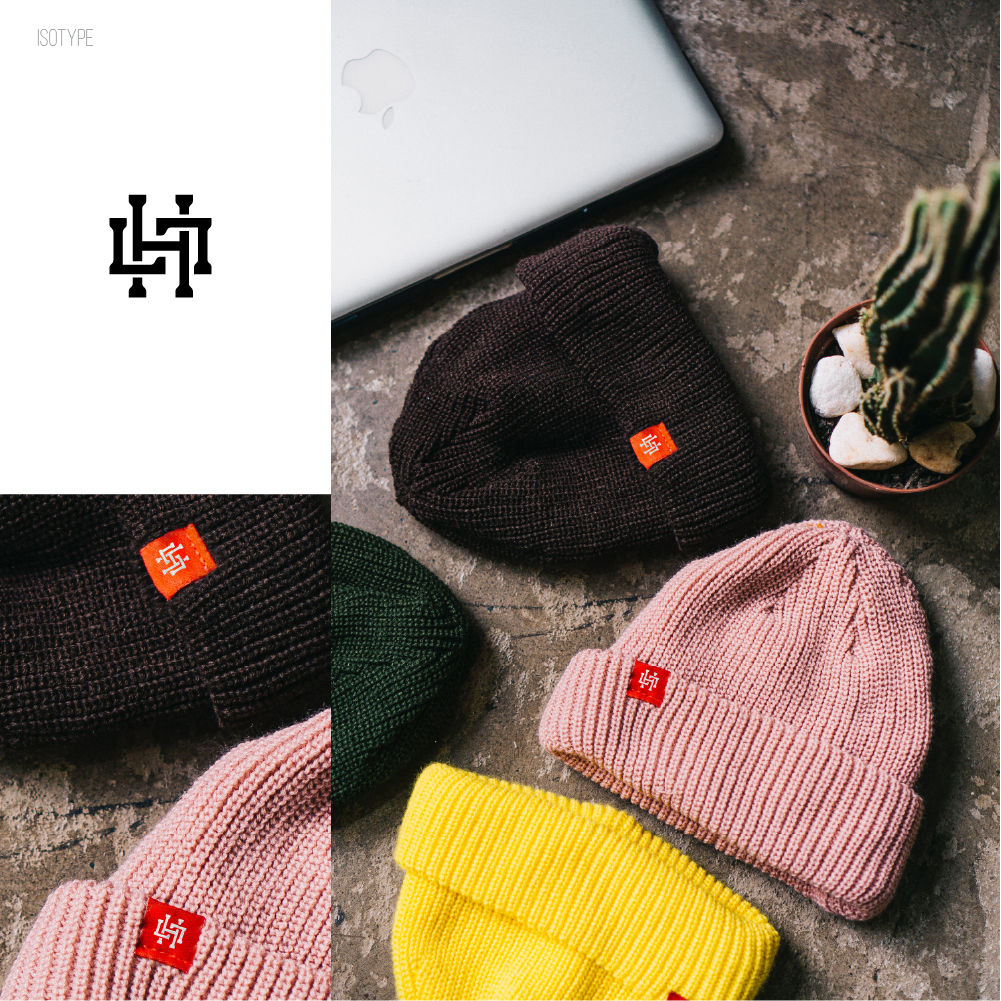
Lighthouse Lids isotype and colorful ribbed beanies with logo tags on a desk.
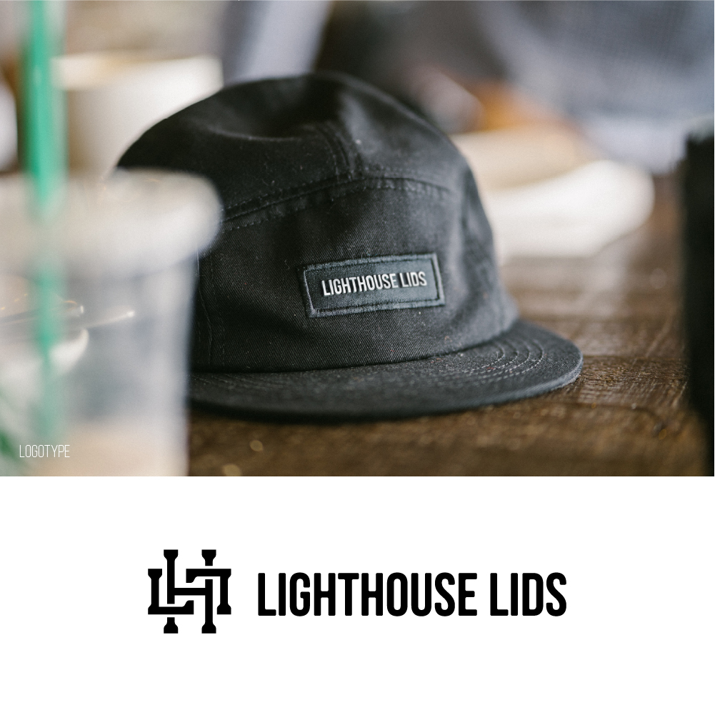
Lighthouse Lids black camper hat with wordmark patch above LH monogram lockup.
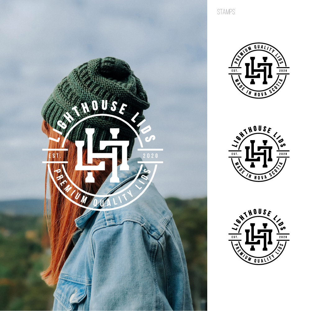
Lighthouse Lids circular stamp logos beside a model in a green beanie outdoors.
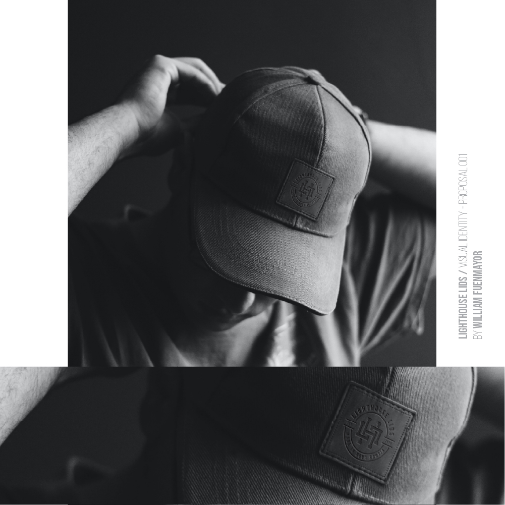
Black-and-white Lighthouse Lids baseball cap with embossed LL patch, proposal still.

Cima / Management System
CIMA visual identity manual cover with stylized mountain peaks and Multitaskers credit.
CIMA brand-manual table of contents page labeled Índice.
CIMA brand-manual Introducción page explaining the visual identity guide purpose.
CIMA coral wordmark with mountain-shaped M and A as the principal isologo.
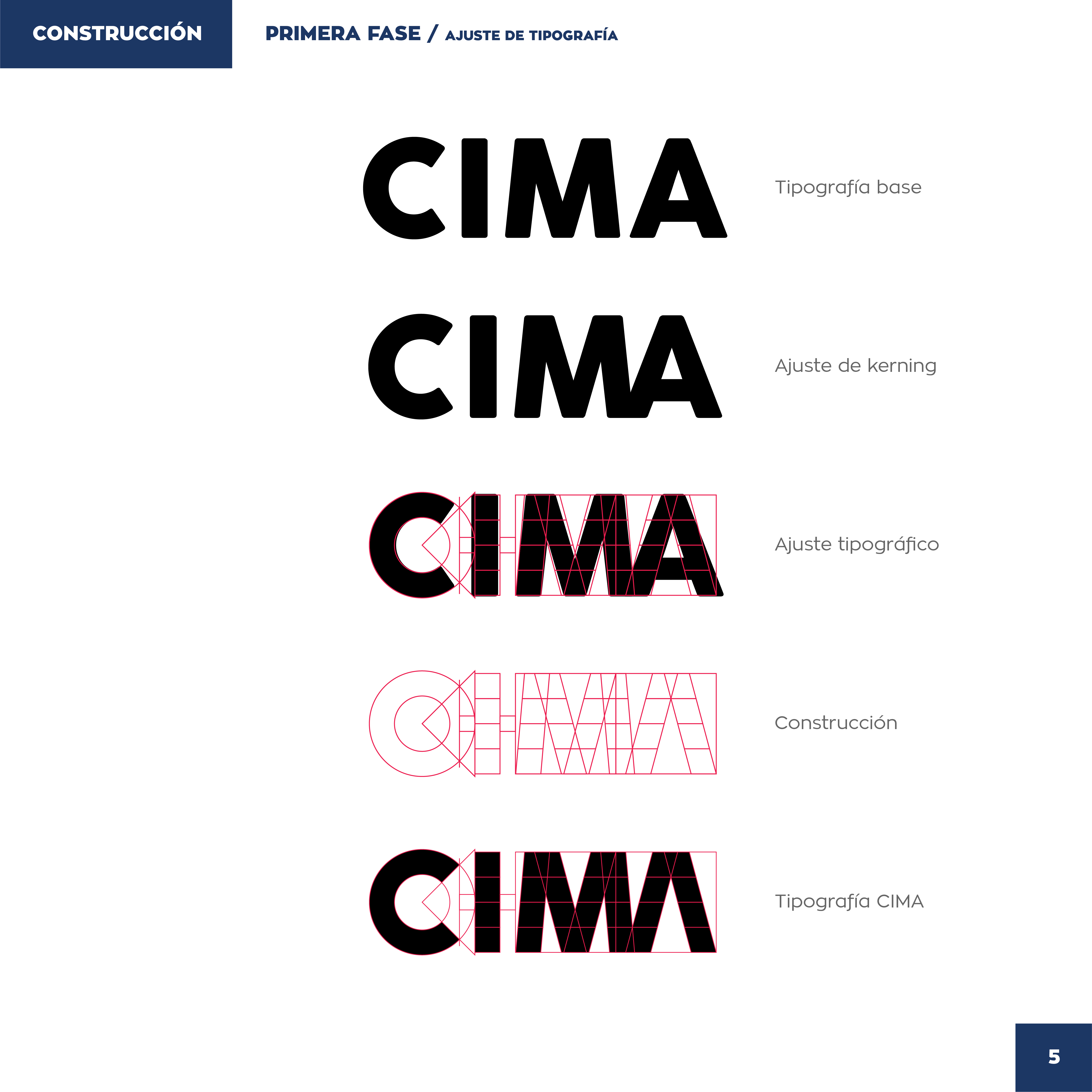
CIMA logo construction steps from base type through kerning to final wordmark.
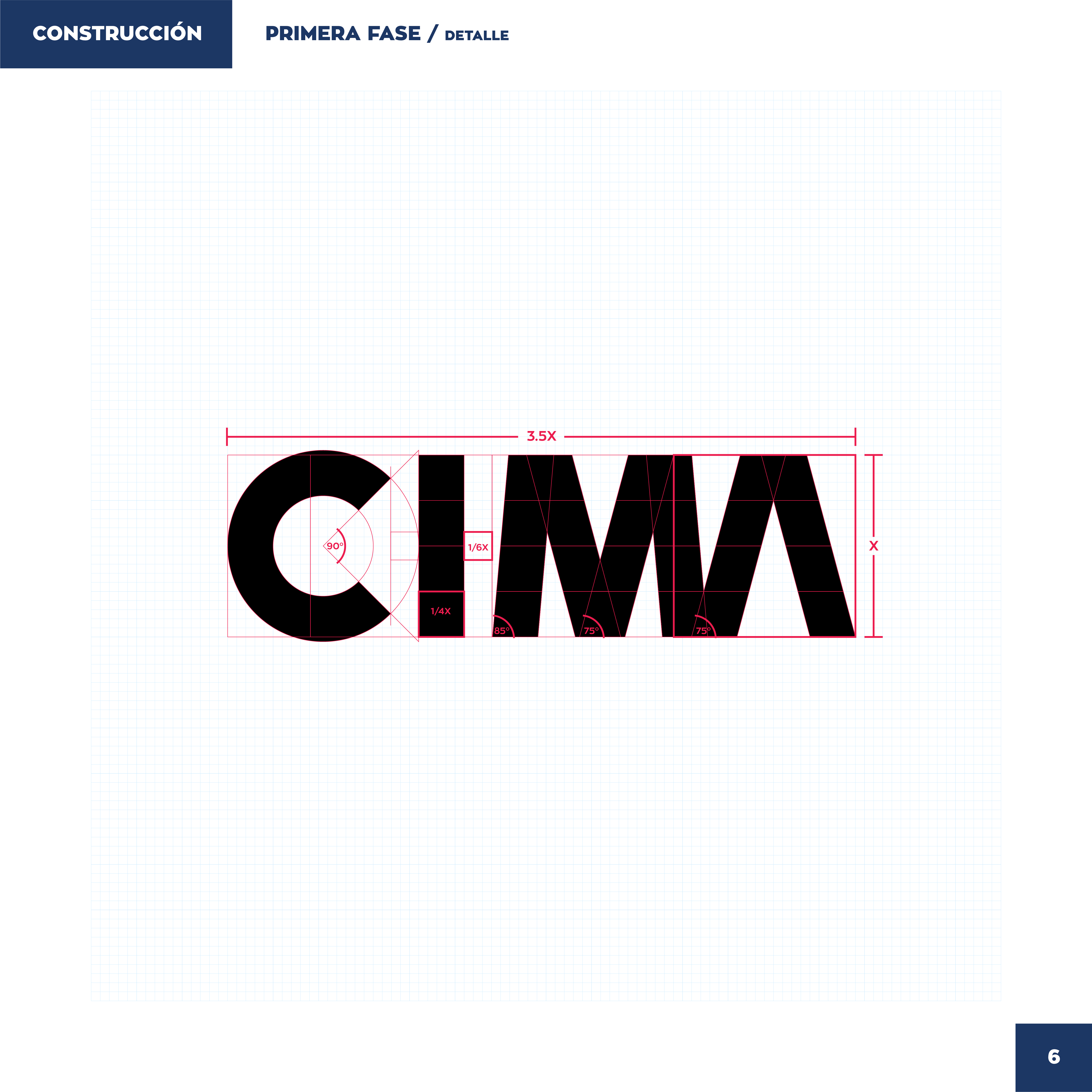
CIMA wordmark on a grid with red construction angles and X-ratio measurements.
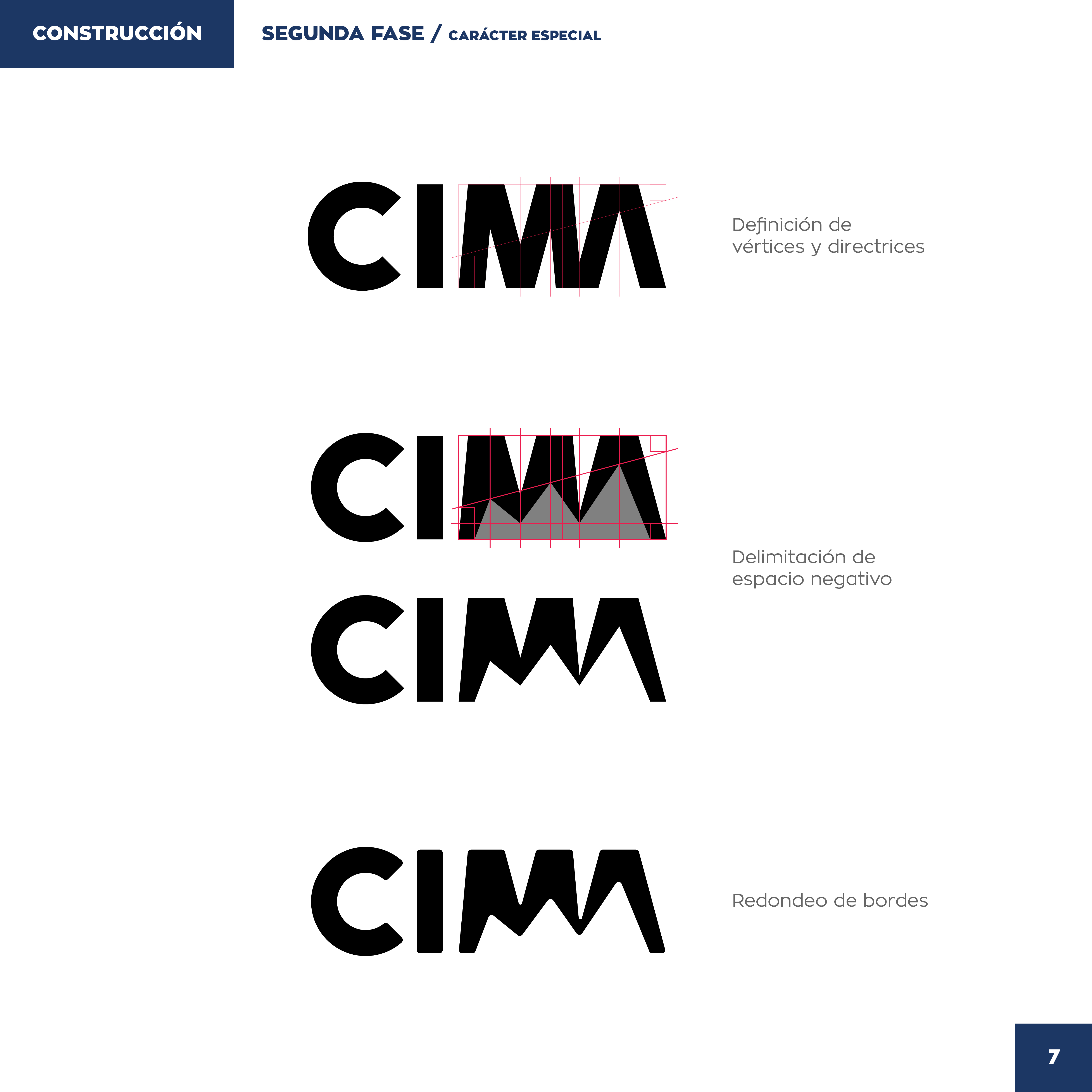
CIMA logo second-phase construction defining mountain MA vertices and edge rounding.
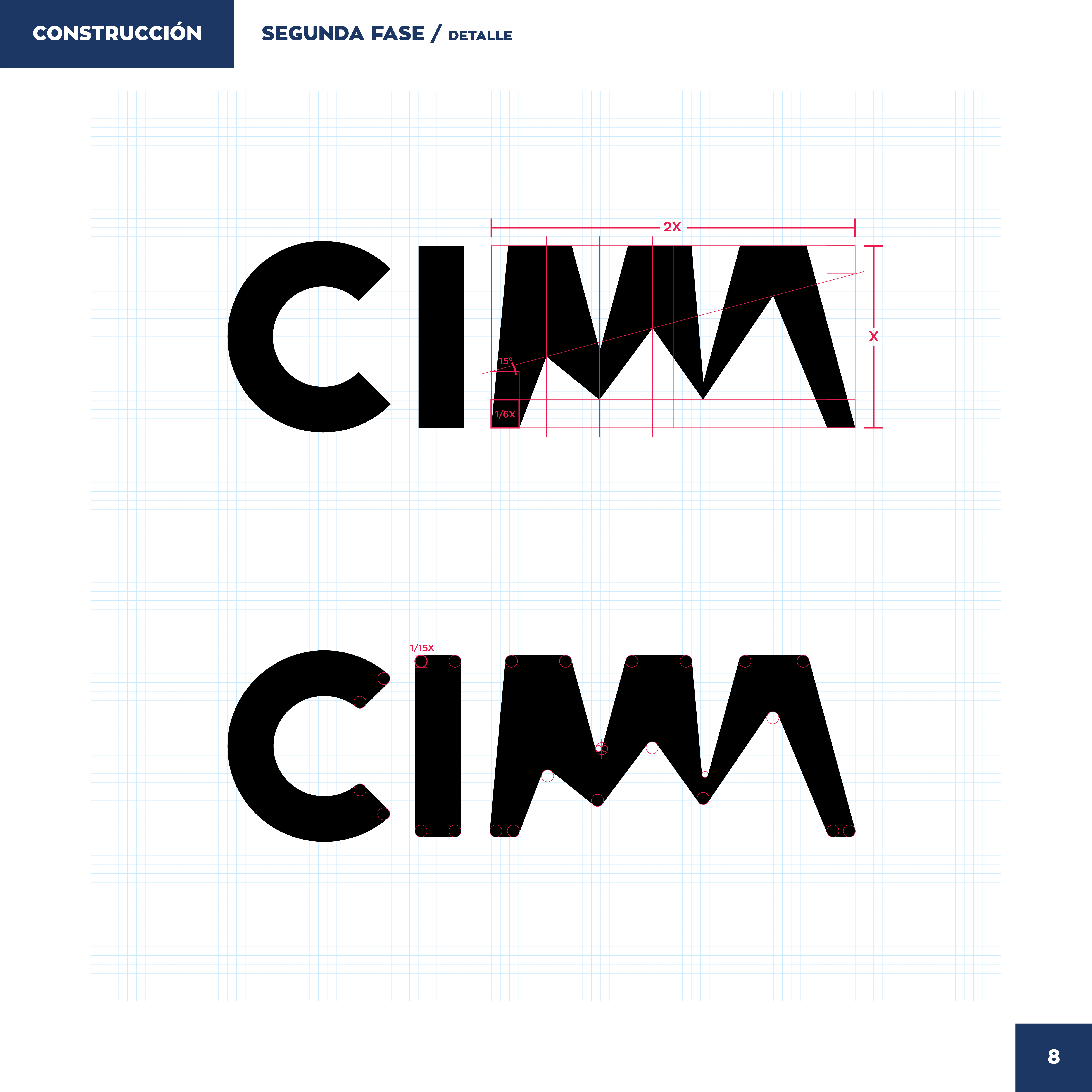
CIMA wordmark detail grid with red 2X and X measurements for the MA letterforms.
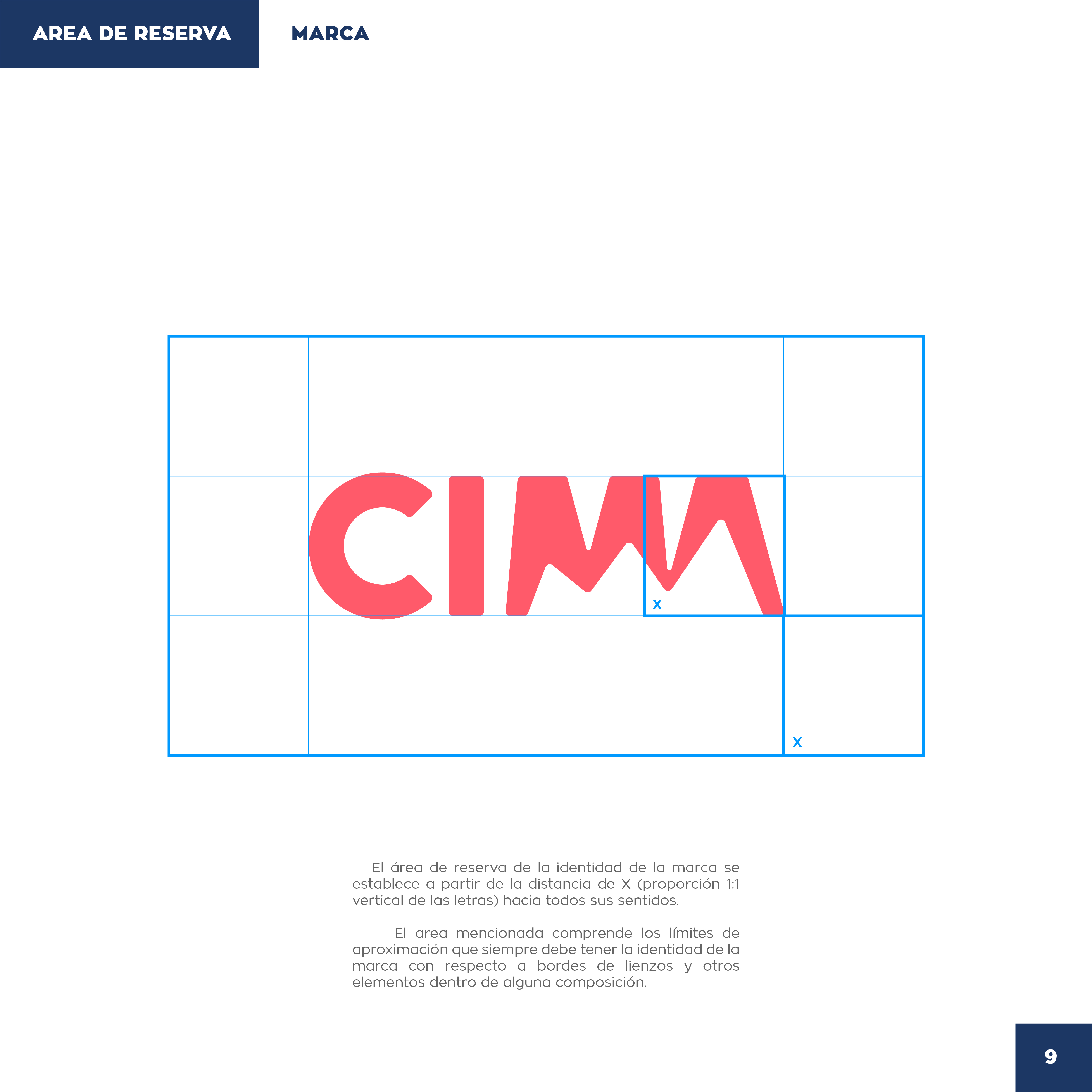
CIMA coral wordmark inside a clear-space grid labeled Área de Reserva.
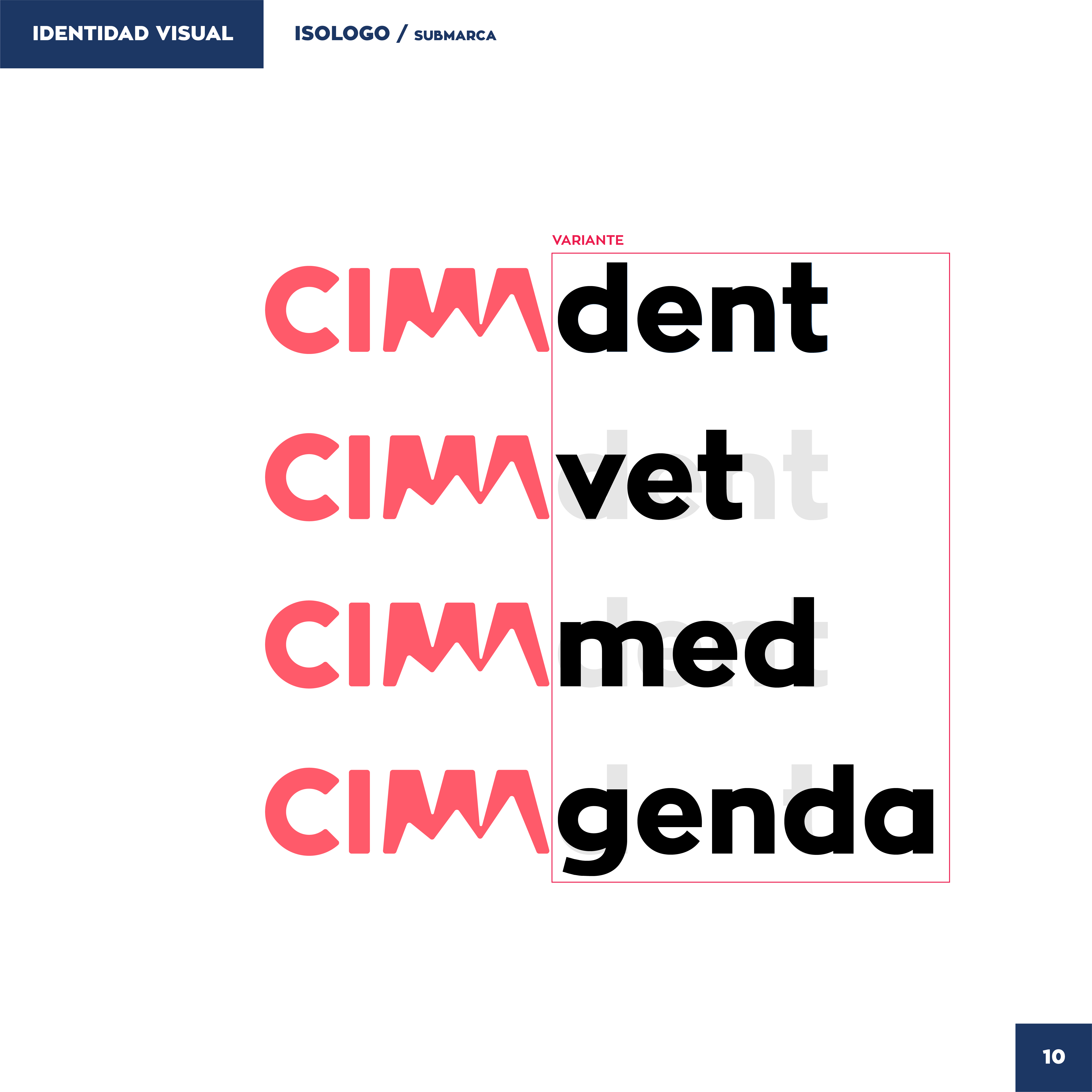
CIMA sub-brand lockups for dent, vet, med, and genda variants.
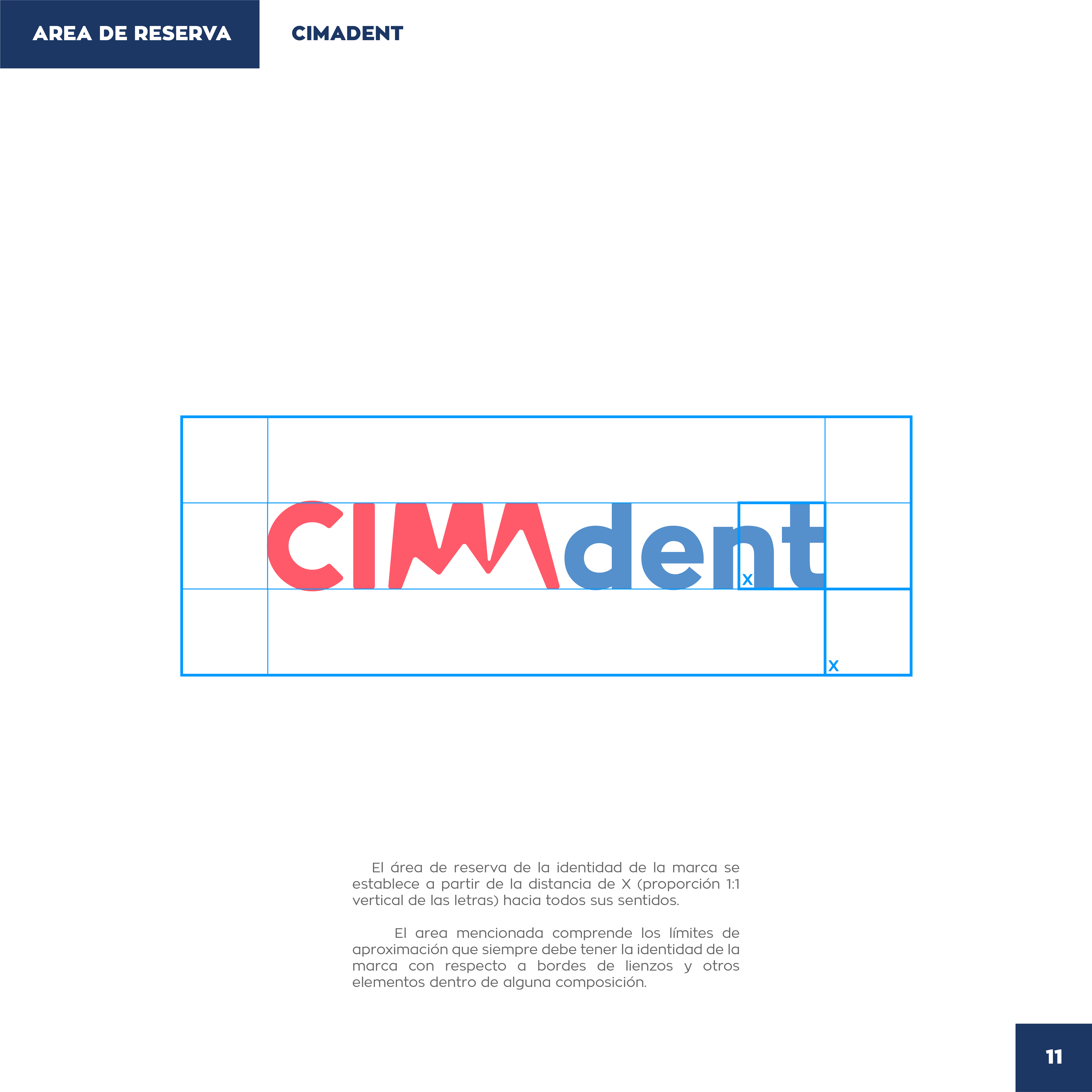
CIMAdent logo with clear-space grid and X-unit reserve rules.
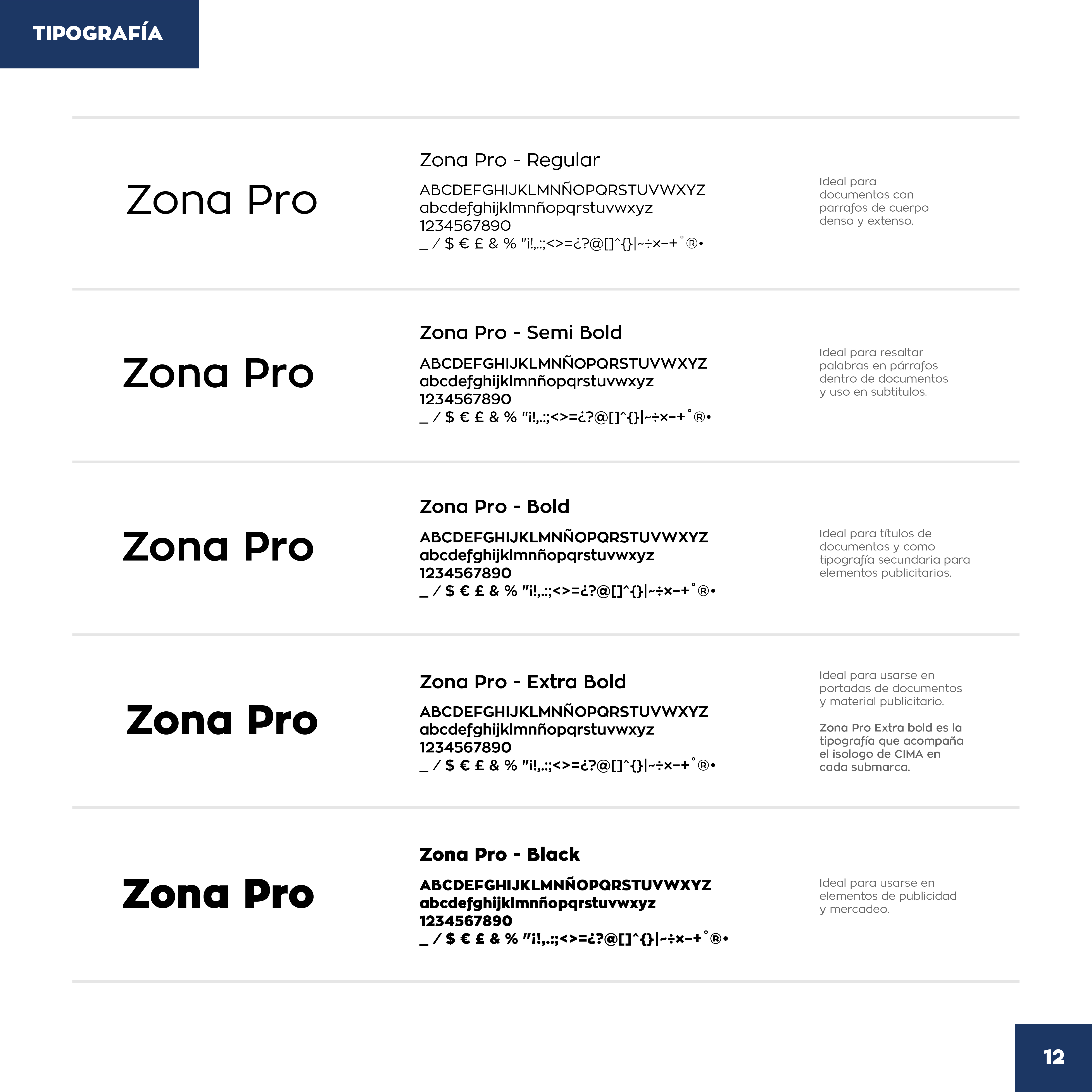
CIMA typography page showing Zona Pro weights from Regular through Black.
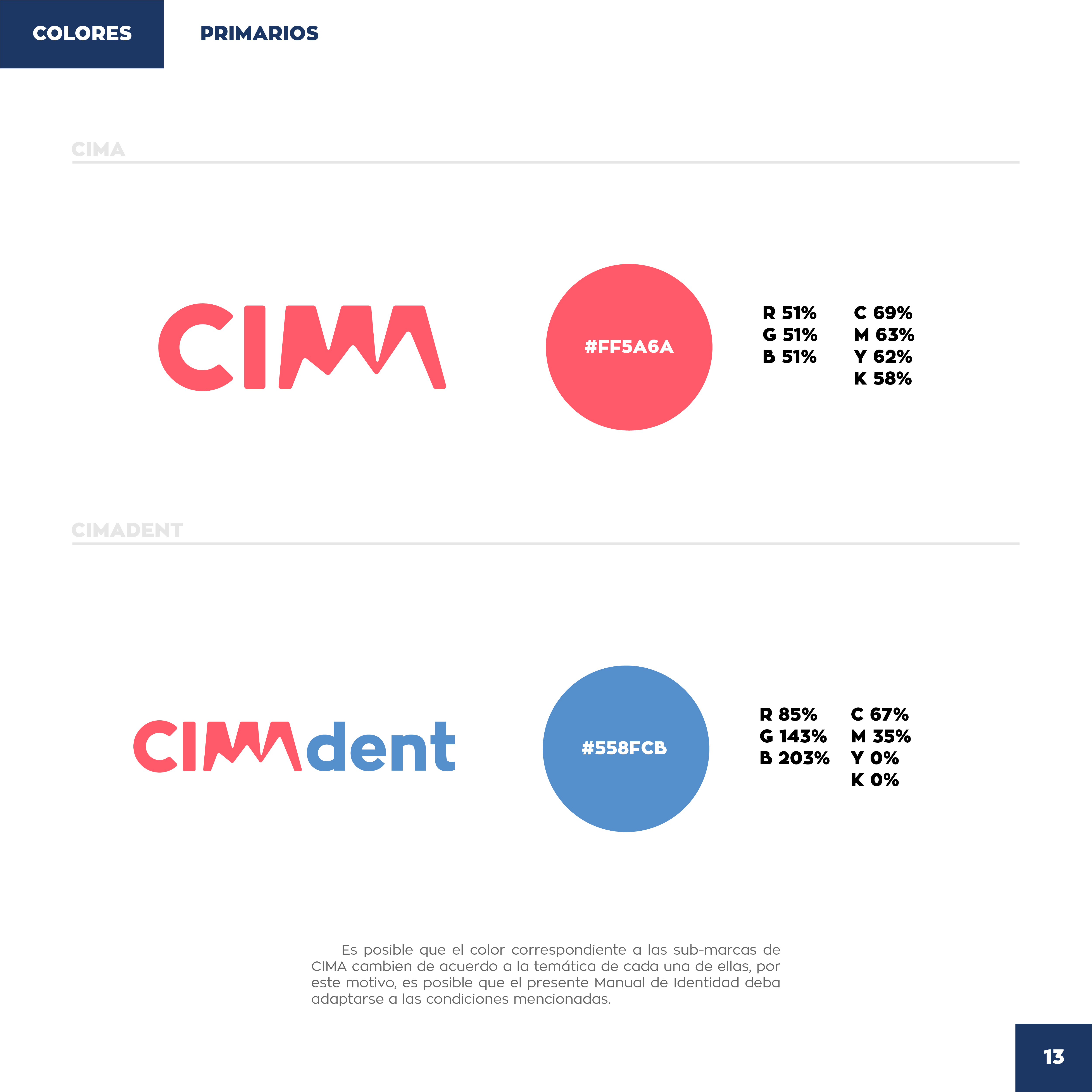
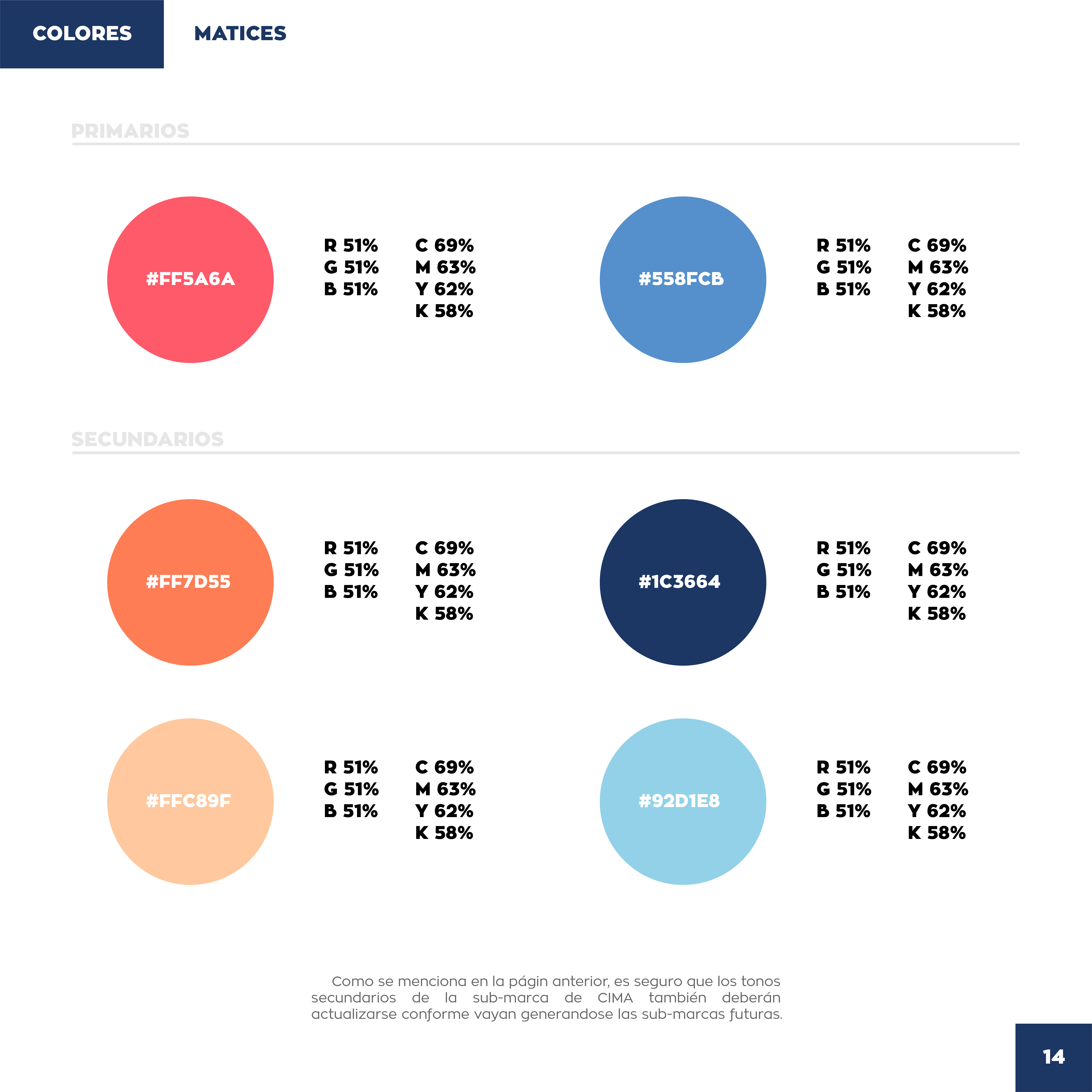
CIMA and CIMAdent primary colors with coral and blue hex, RGB, and CMYK specs.
CIMA primary and secondary color swatches with hex codes in circular chips.
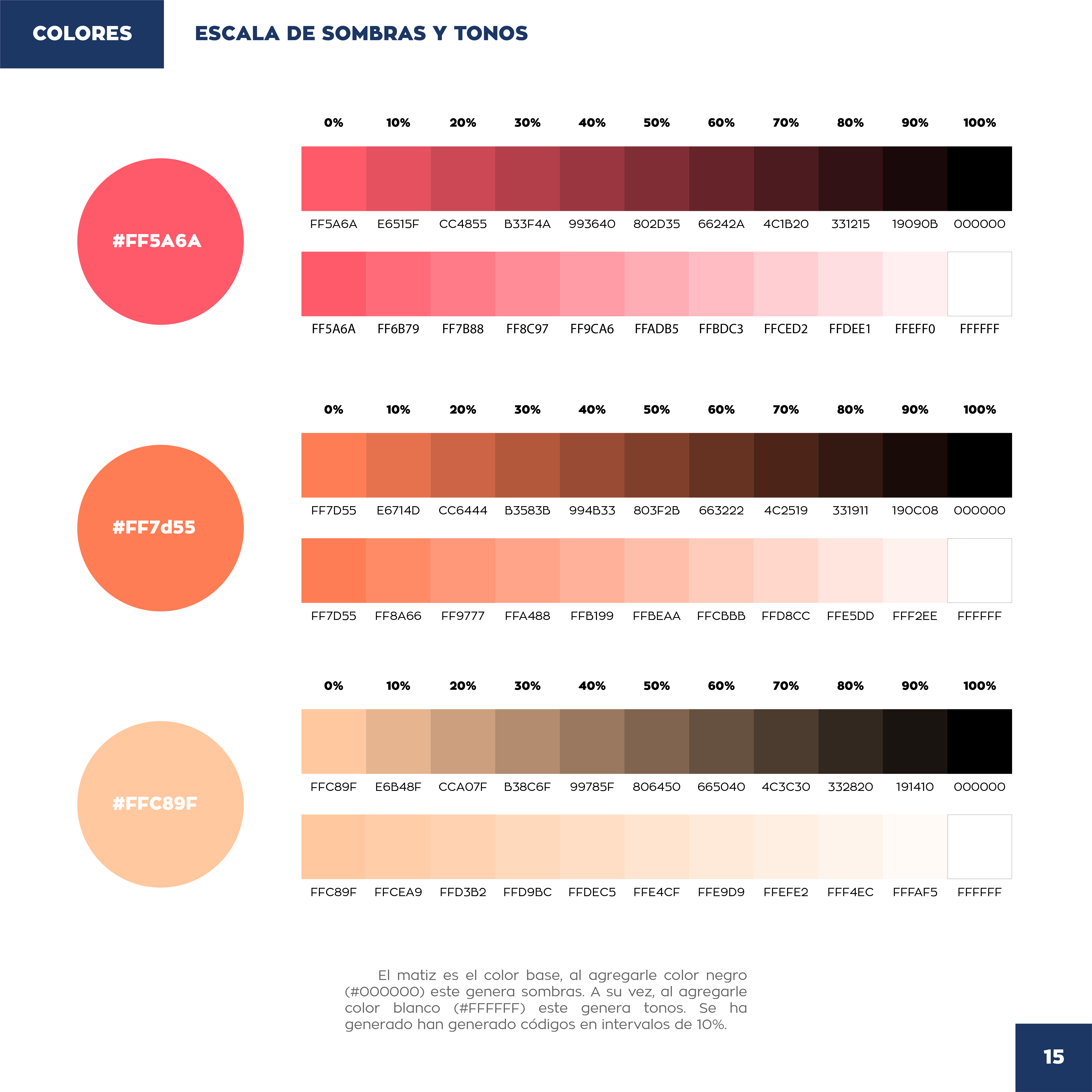
CIMA coral and peach shade-and-tint scales from base color to black and white.
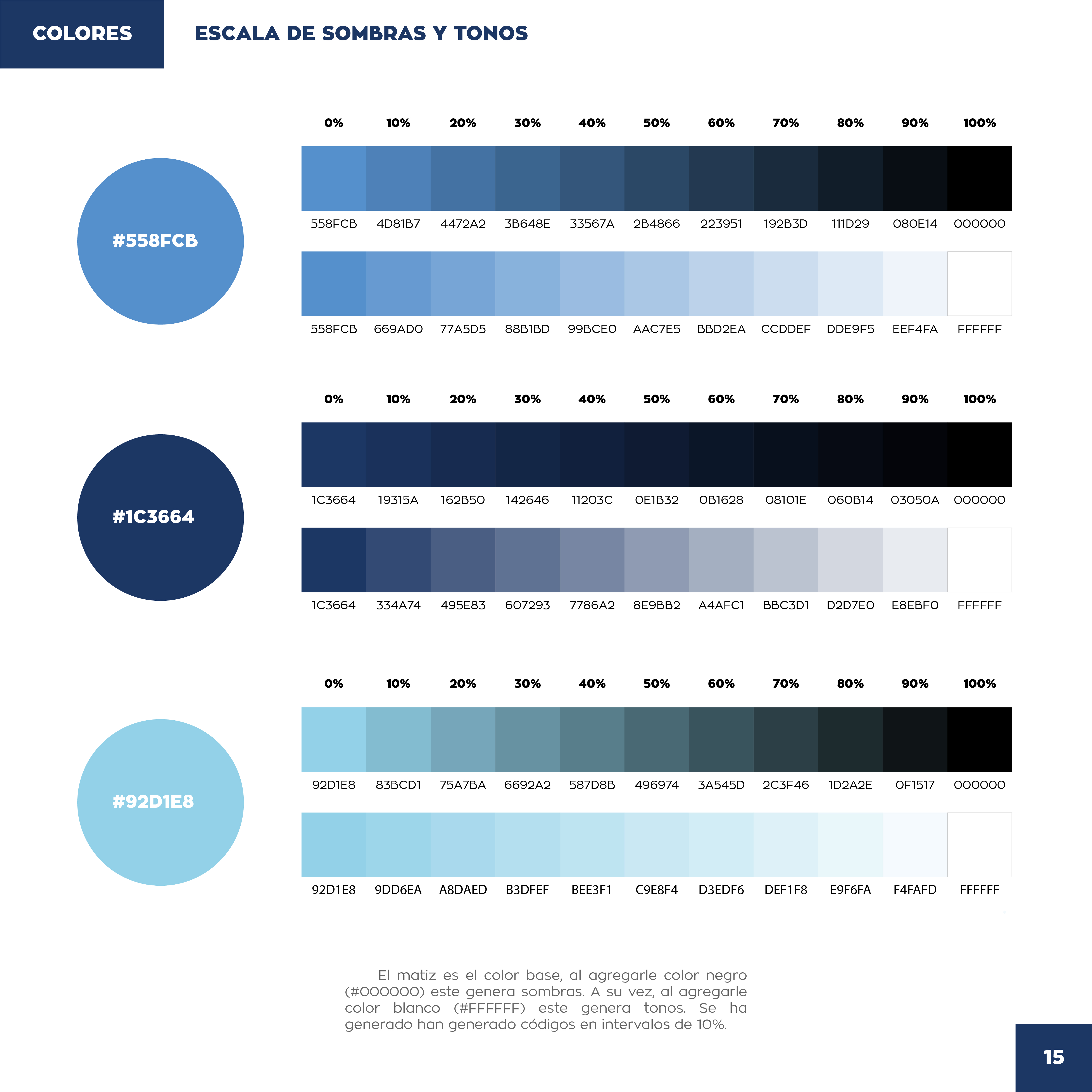
CIMA blue shade-and-tint scales for medium, navy, and sky blue brand colors.
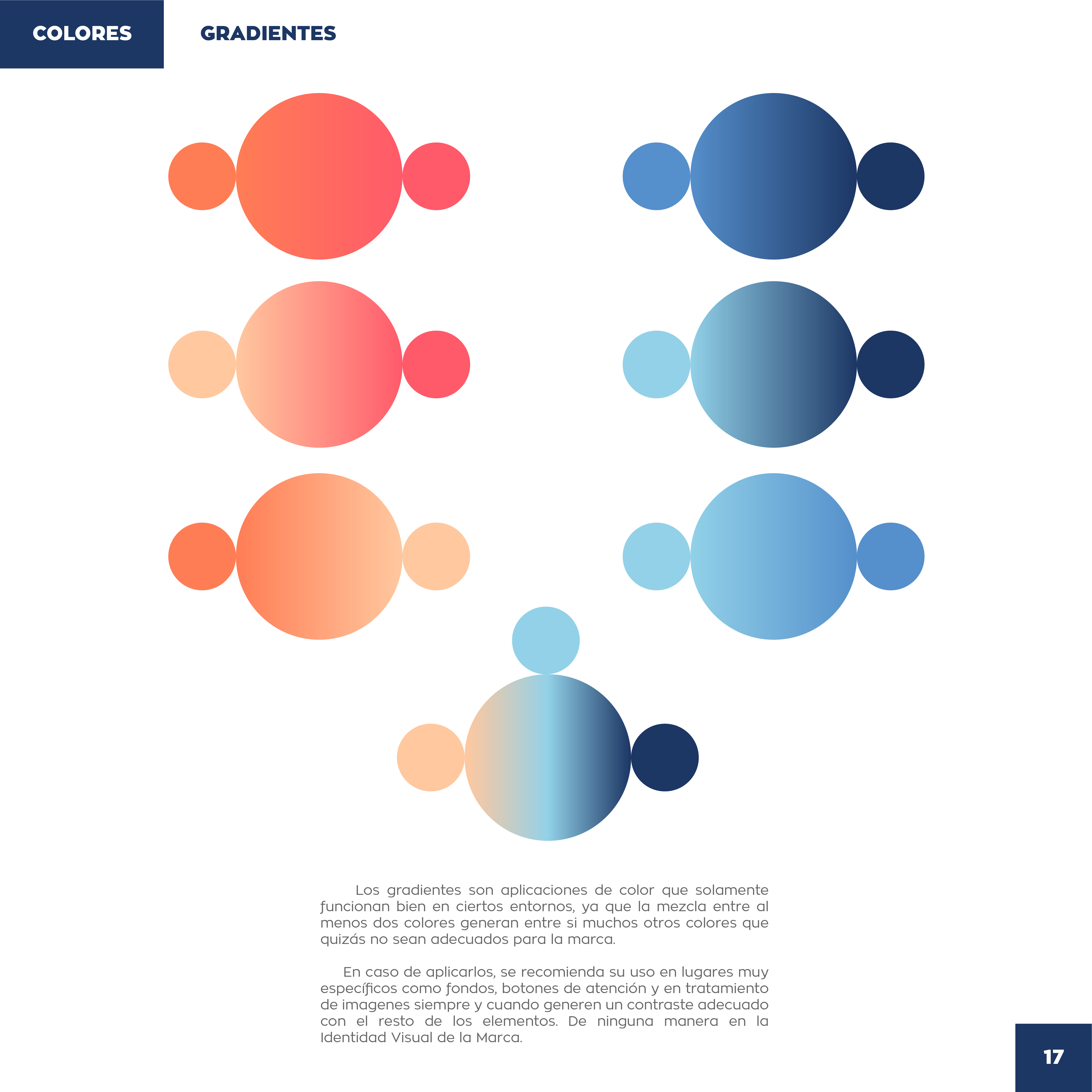
CIMA gradient examples in coral-to-peach and navy-to-sky circular shapes.
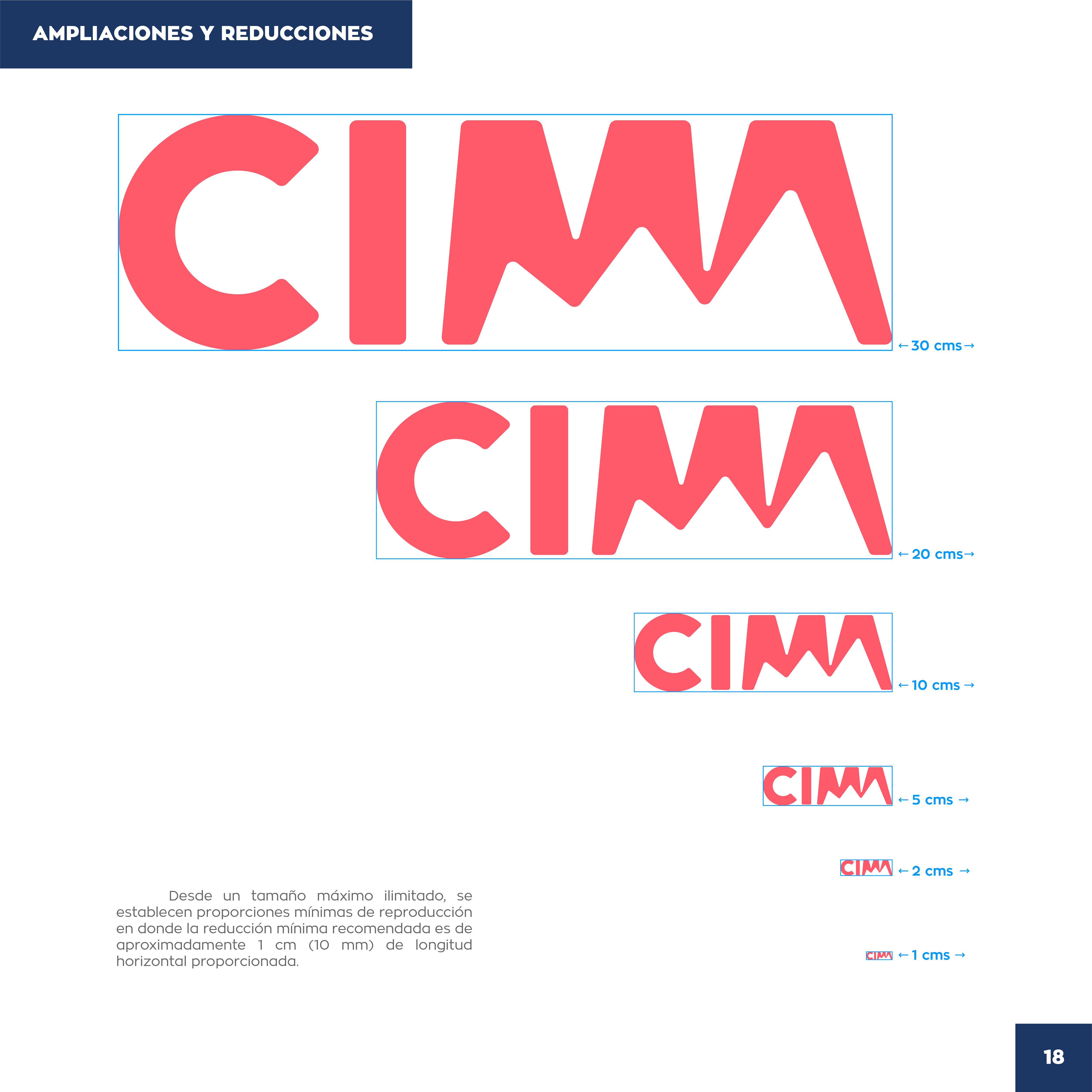
CIMA logo size scale from 30 cm down to 1 cm minimum reproduction width.
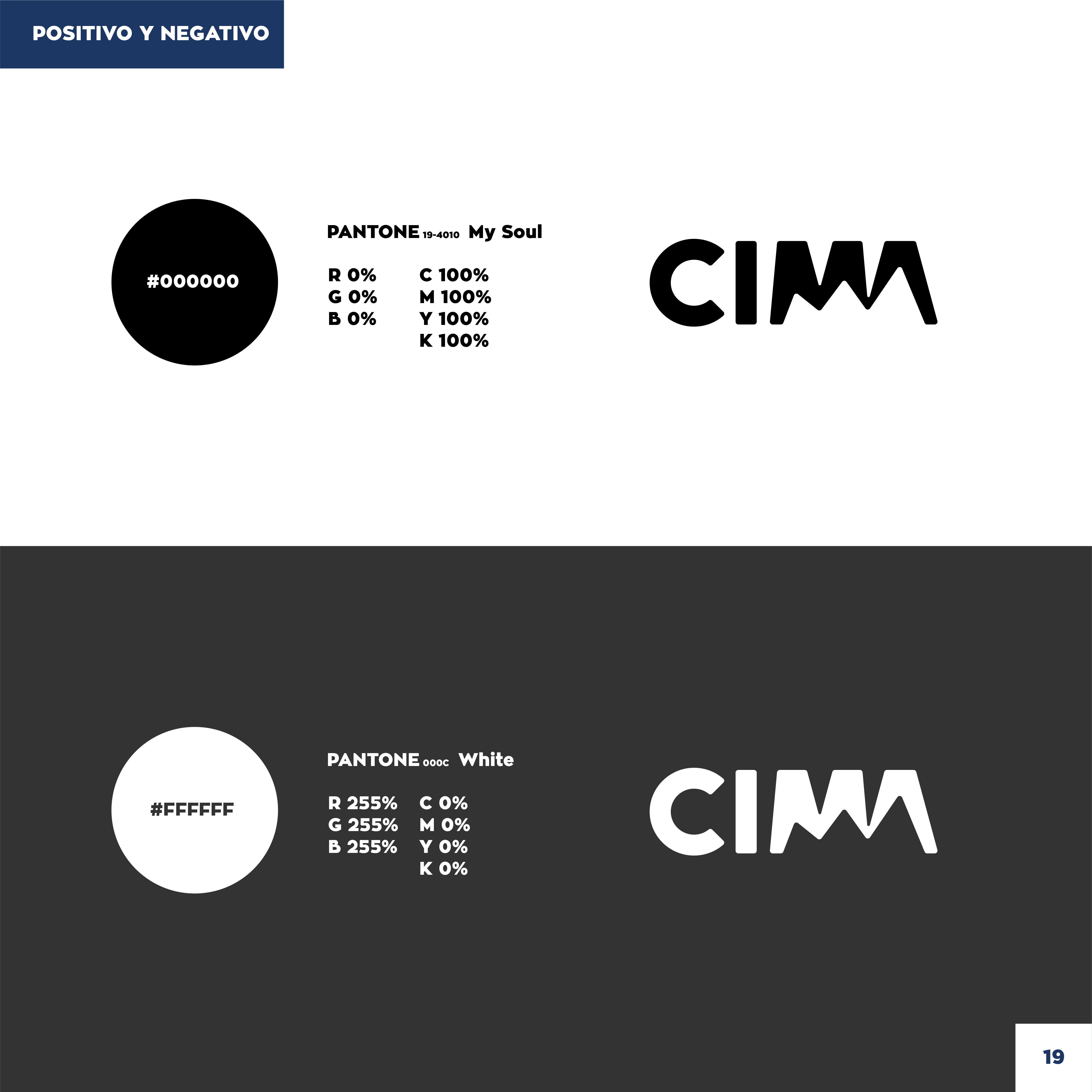
CIMA logo in black positive and white negative versions with Pantone specs.
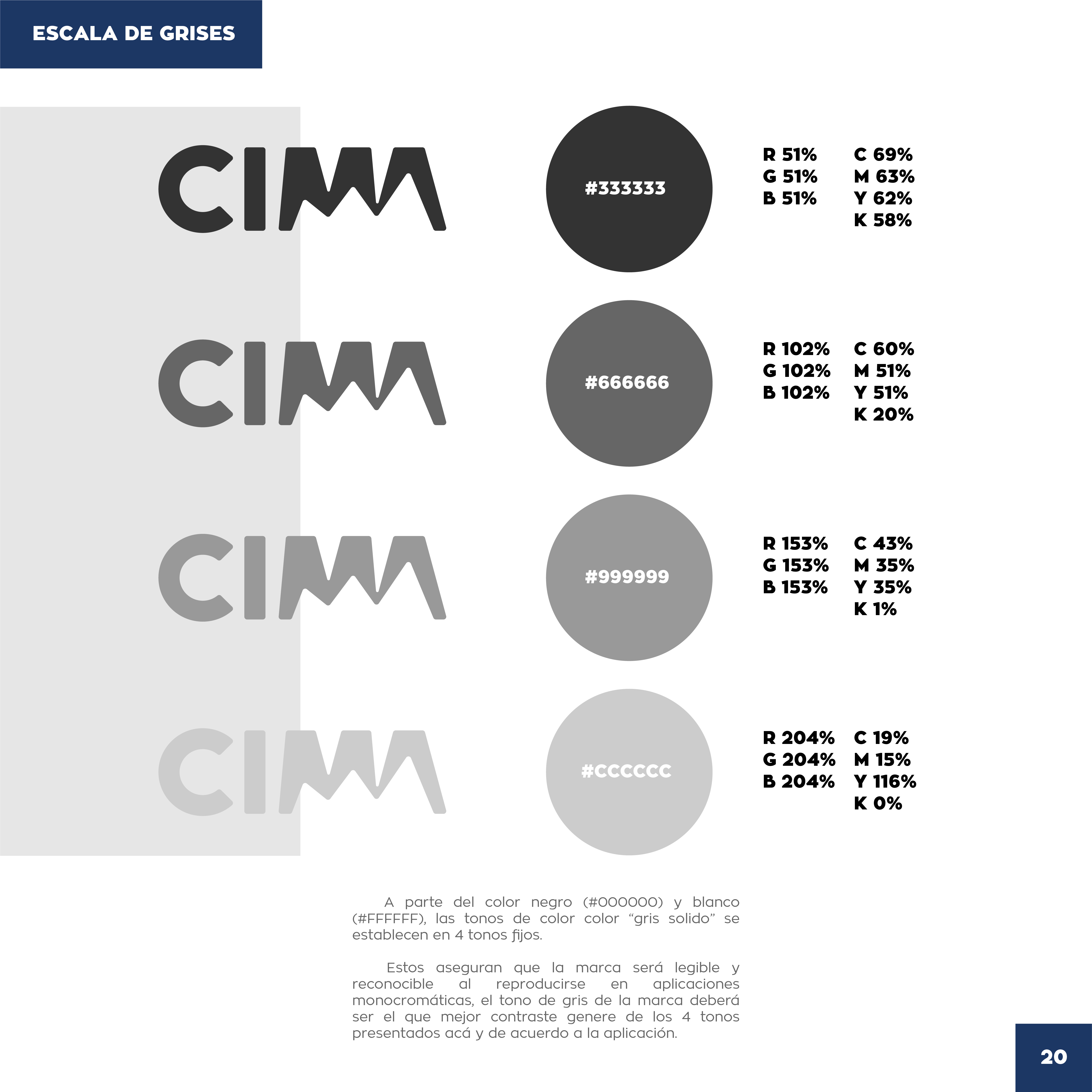
CIMA logo in four solid gray tones from dark charcoal to light gray.
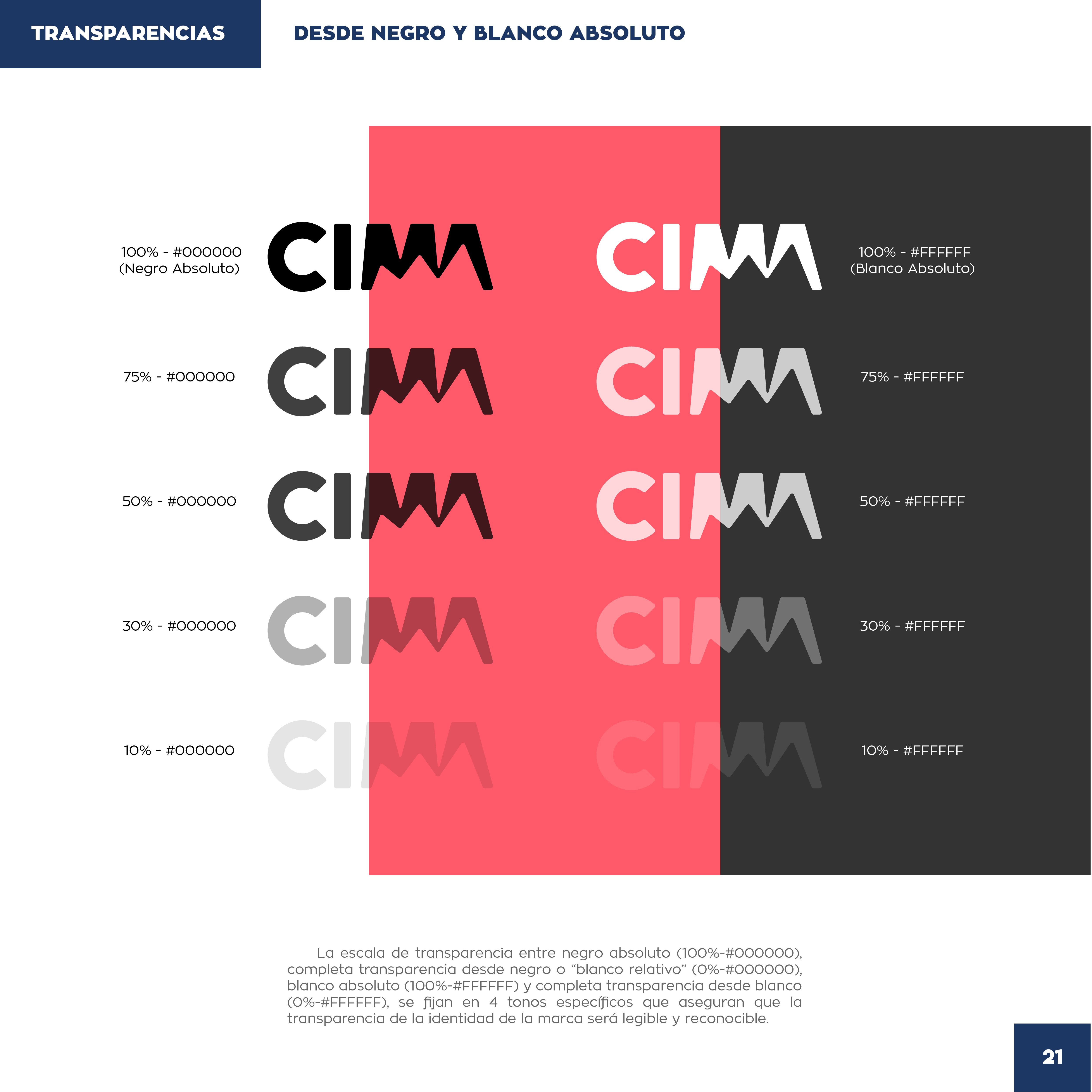
CIMA black and white logo opacity steps from 100% to 10% on split backgrounds.
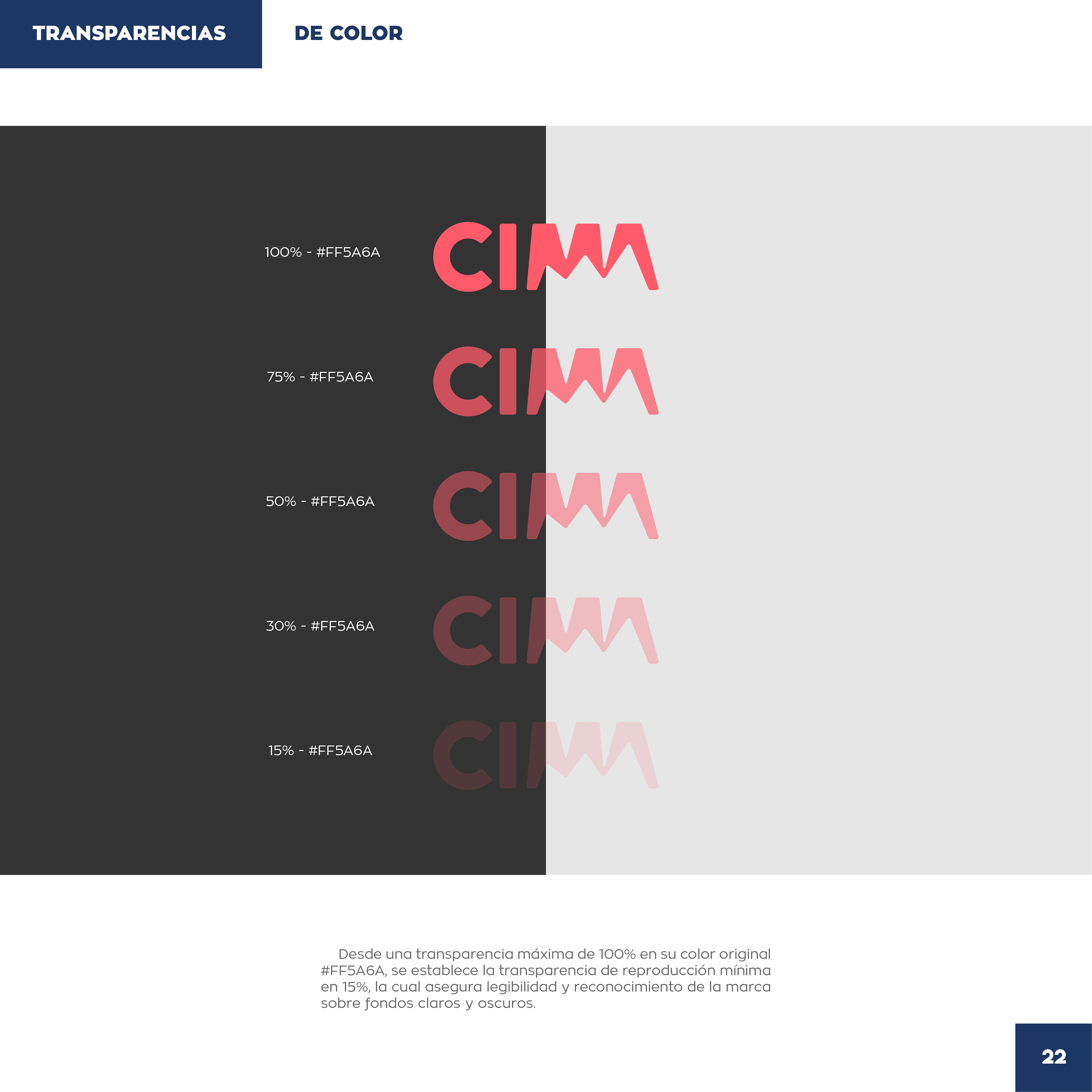
CIMA coral logo opacity steps from 100% to 15% on dark and light backgrounds.
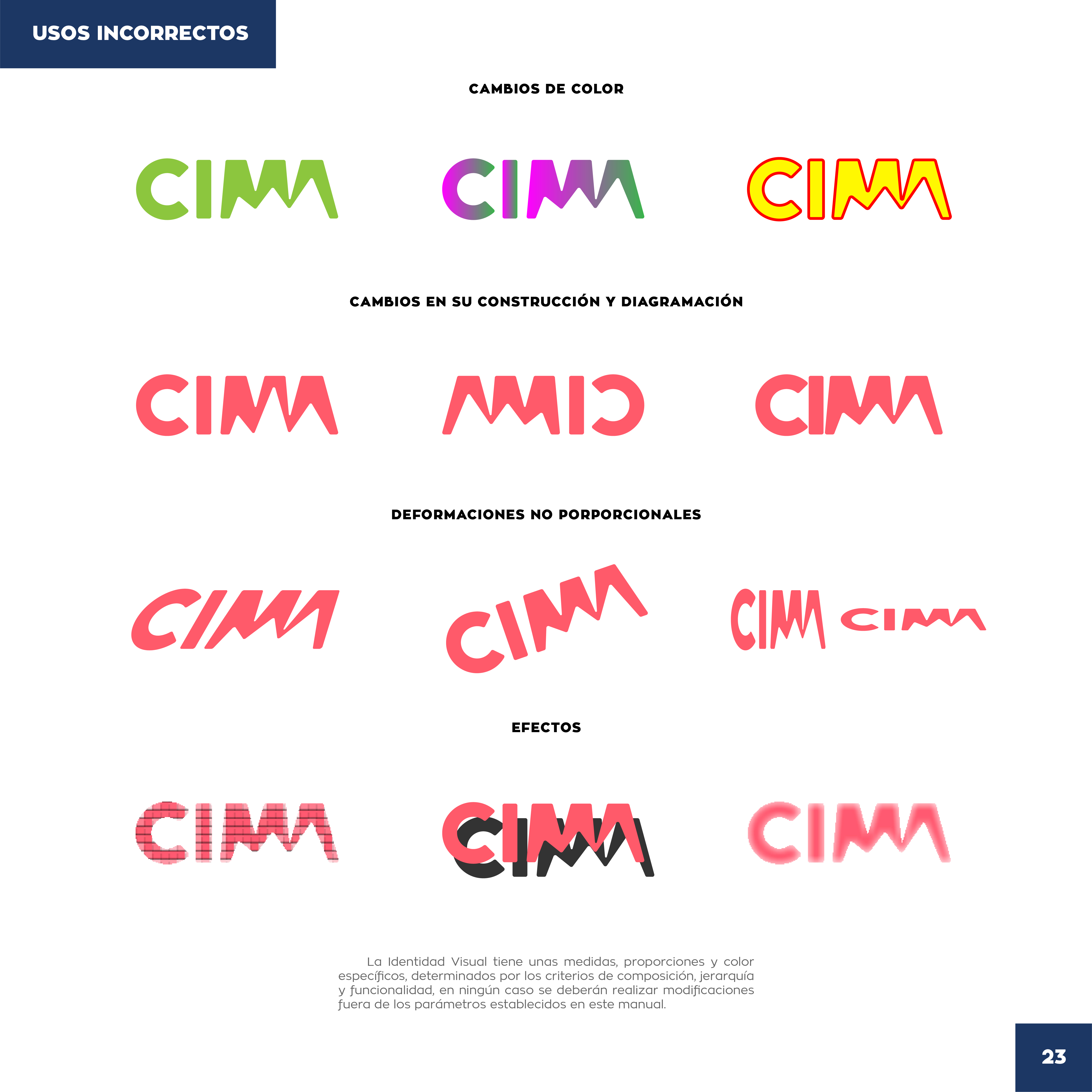
CIMA incorrect-use examples showing wrong colors, spacing, skew, and effects.
CIMA coral wordmark closing page with Multitaskers credit and Santiago 2021 contact.